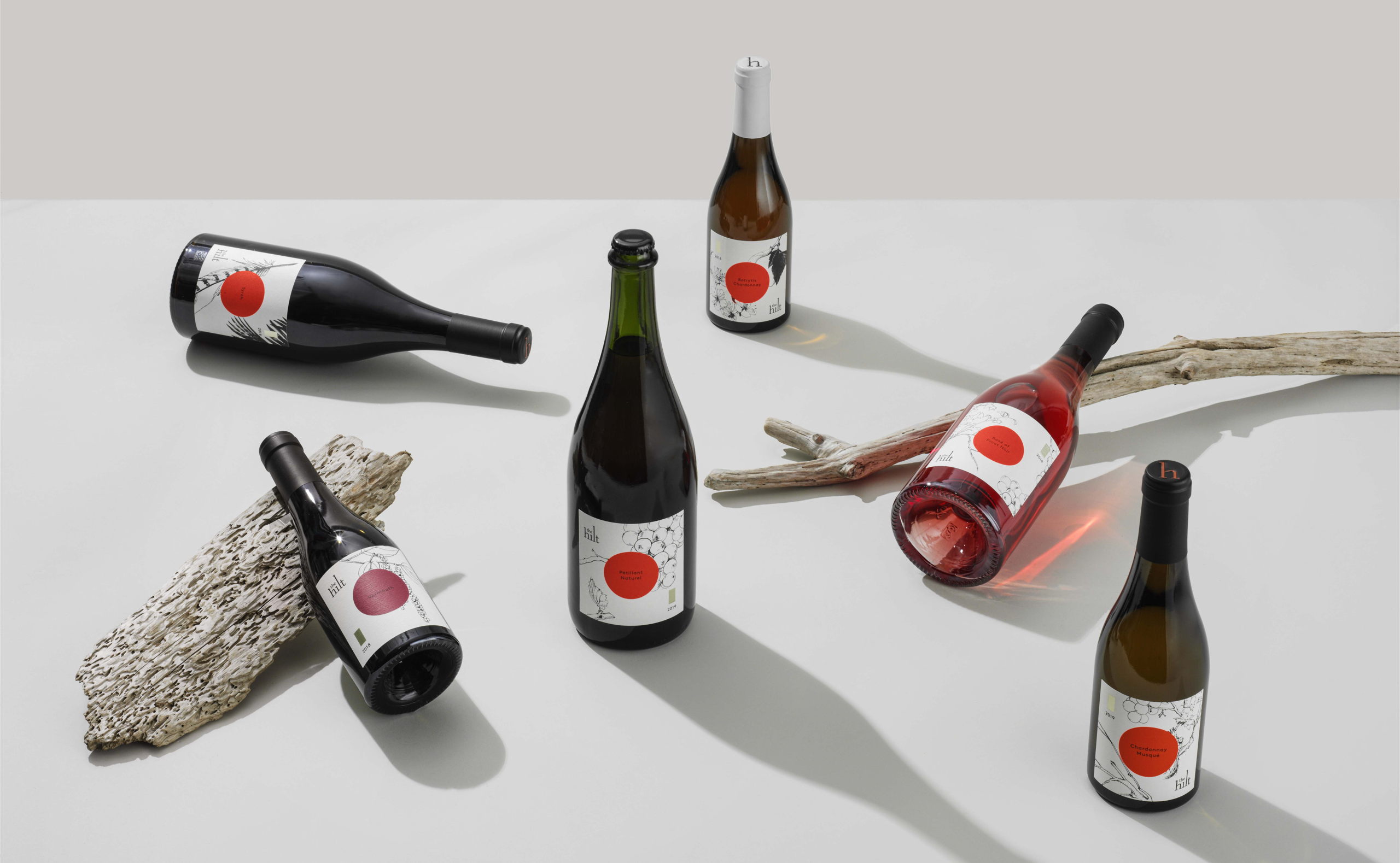
The Hilt wines get a human touch with their redesign. Utilizing the stunning thin-line illustrations by Lauren Nassef, these bottles are adorned with fruits, feathers, berries, with gentle strokes that make each label look like it was drawn right before being placed on the shelf. These small details make the H in Hilt look even larger than life, fitting for a brand that conveys luxury in every moment.
A label redesign to evoke the terrior of Sta. Rita Hills, home of The Hilt.
LMNOP wanted to update the look and feel for The Hilt wines to reflect their individual characteristics. We collaborated closely with illustrator Lauren Nassef on illustrations that evoke texture and movement for The Hilt’s signature Estate tier. Foil accents and subtle clear foils evoke a feeling of luxury with a light hand, adding to the feeling of refrigerated sun intrinsic to the winemaker’s intent. For the most experimental wines, A Different Breed, we made a departure from the cool golds and blues of the other tiers for a suite of expressive labels that reflect the innovative techniques that set these wines apart.