THIS IS IT! DIELINE Awards 2026 Late Entry Deadline Ends Feb 28
Hey Binx’s THC Powders Are Unapologetically Loud
By
Published
Filed under
By
Published
Filed under
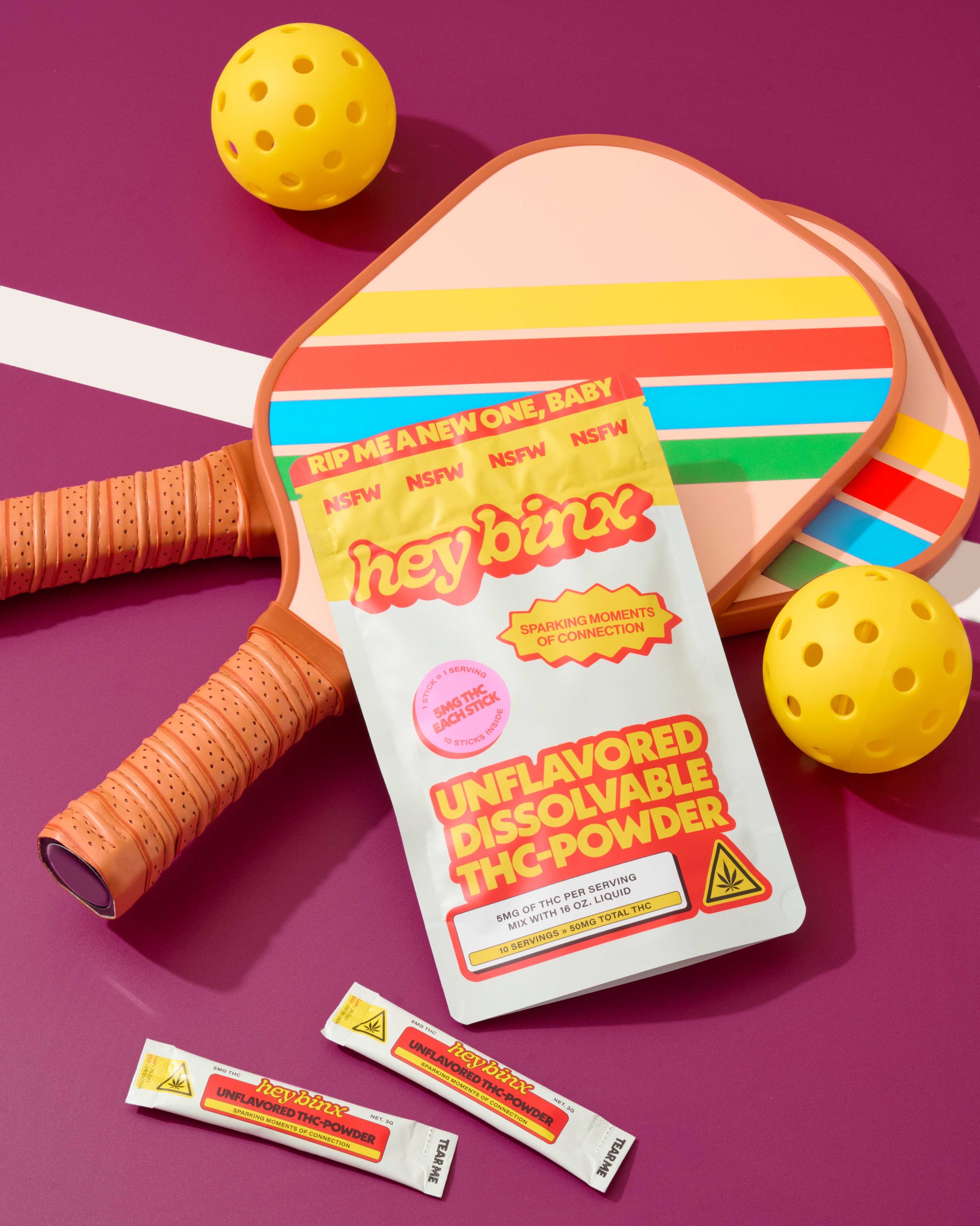
Hey Binx’s packaging, courtesy of Studio Linear, opts for a pop-maximalist approach for its THC powders. Bubble typography nods to 70s branding and underground comics, while high-contrast gradients and candy brights reference rave flyers and early internet graphics.
Cartoon icons and blunt instructional panels borrow from consumer warning labels, turning regulation into anything but a design constraint. I love when cannabis packaging plays into all the cliches, and Binx has done it without feeling like it’s the butt of the joke.
Andrea Beaulieu, founder and creative director of Studio Linear, details the design process below.
Get unlimited access to latest industry news, 27,000+ articles and case studies.
Have an account? Sign in