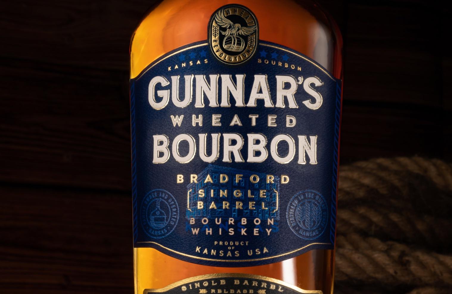
Brand Hatch Creative designed the packaging system for Gunnar’s Wheated Bourbon. The rebrand better encapsulates the brand’s sense of craftsmanship and balance, especially with the label featuring an illustration of the Bradford Distillery, also incorporated into the overall branding of Gunnar’s Distillery. Additionally, the colors are rich and masculine, and the typography reiterates the same stark, bold confidence.
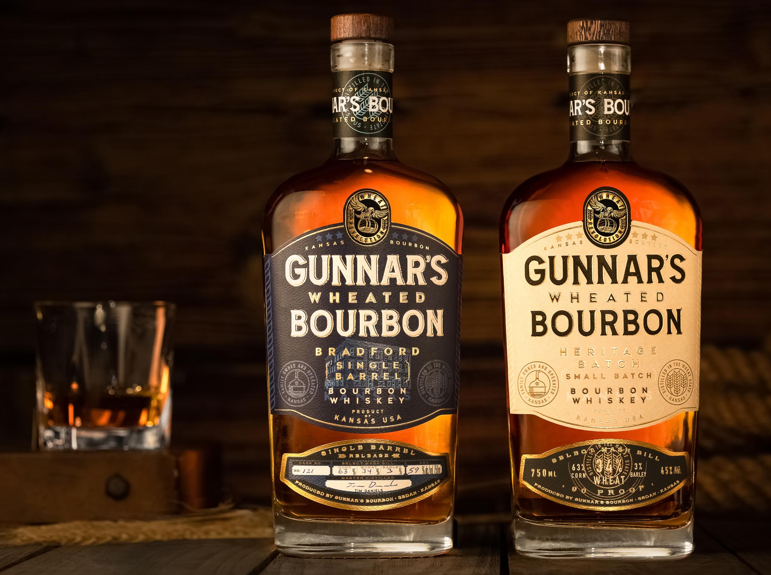
Gunnar’s Wheated Bourbon, where heritage meets the “Wheat Revolution”. Originating from the wheat state of Kansas, in the small town of Sedan, housed in the historic Bradford Hotel. Gunnar’s Bourbon embodies the rich heritage and local pride, with a strong emphasis on using locally sourced ingredients, specifically wheat. Gunnar’s Bourbon represents the essence of Kansas and its agricultural legacy.