Future Château Delicately Balances the Future and Past
By
Published
Filed under

By
Published
Filed under

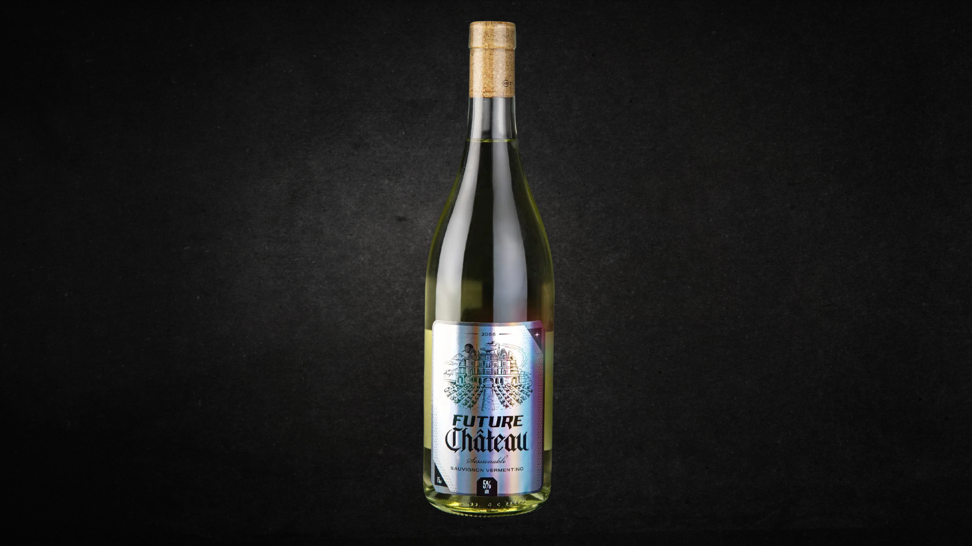
Future Château’s label, designed by Analogue, feels like a time traveler’s artifact, where medieval typography and a holographic sheen coexist on the same surface.
The use of Blackletter asserts old-world authority, but the branding’s crisp refinement avoids nostalgia. The iridescent foil shifts from oil-slick hues to soft tones, while an engraved style château illustration borrows classical wine cues but flattens and unsettles them.
It’s all about tension, and it’s working. Faye Mathieson, Head of Culture at Analogue, goes into the design process below.
Get unlimited access to latest industry news, 27,000+ articles and case studies.
Have an account? Sign in