The Labelmaker’s packaging design for Find Me Wines is a breath of fresh air. Utterly simple, yet the central theme of showcasing the winery’s coordinates shines through the design. The paper used for the coordinates changes levels of transparency based on how the light shines. This effect creates visual interestest in an elegantly minimal way.
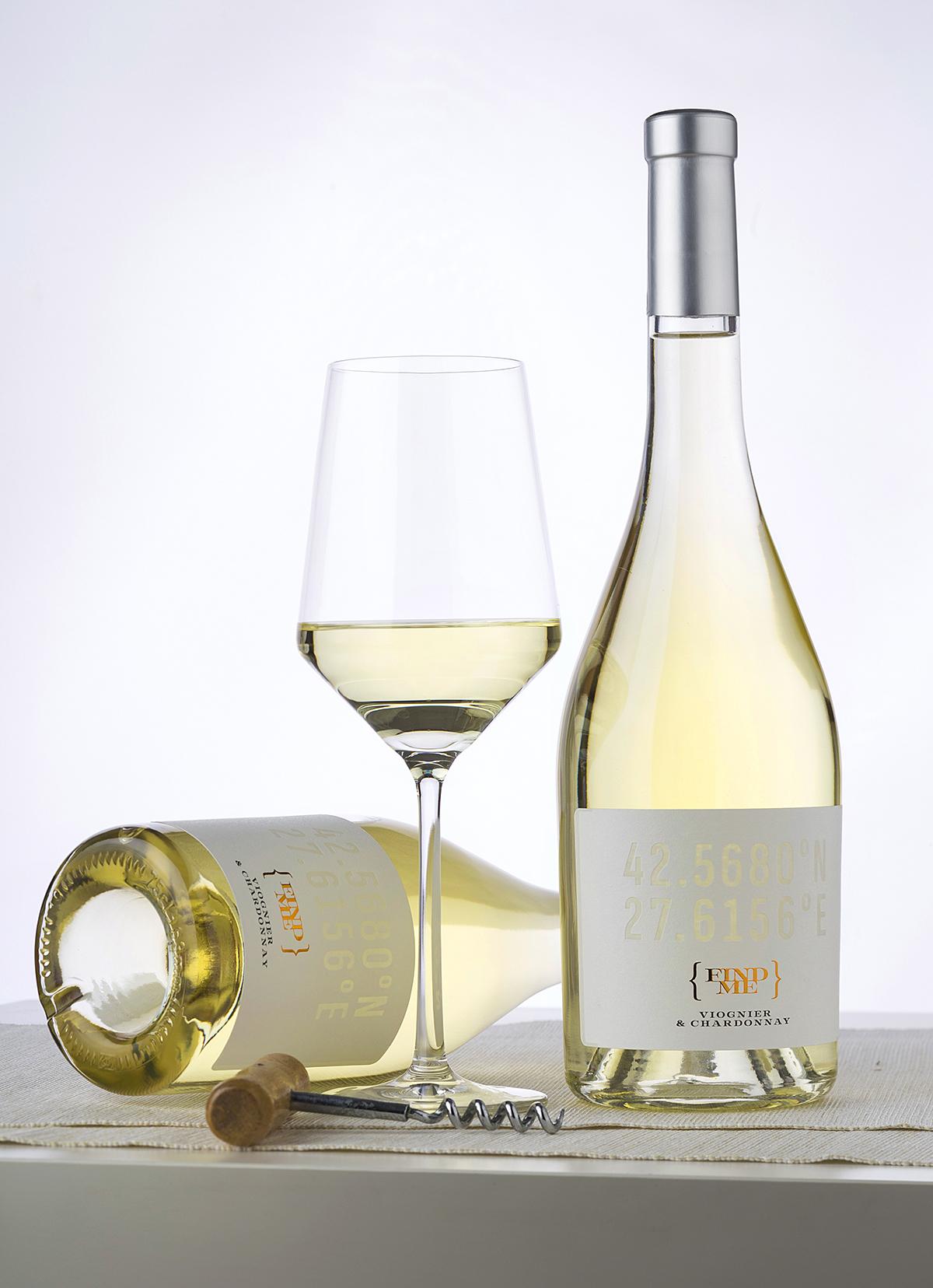
A Minimalist Unconventional Label Design for Premium Wines Find Me is one of the most unusual projects I’ve been involved in lately. The name itself is the winner of a competition organized by my client – Black Sea Gold, Pomorie.