Evolving the Identity for a New Format of Cold Climate Wines for the Roost Winery
By
Published
Filed under

By
Published
Filed under
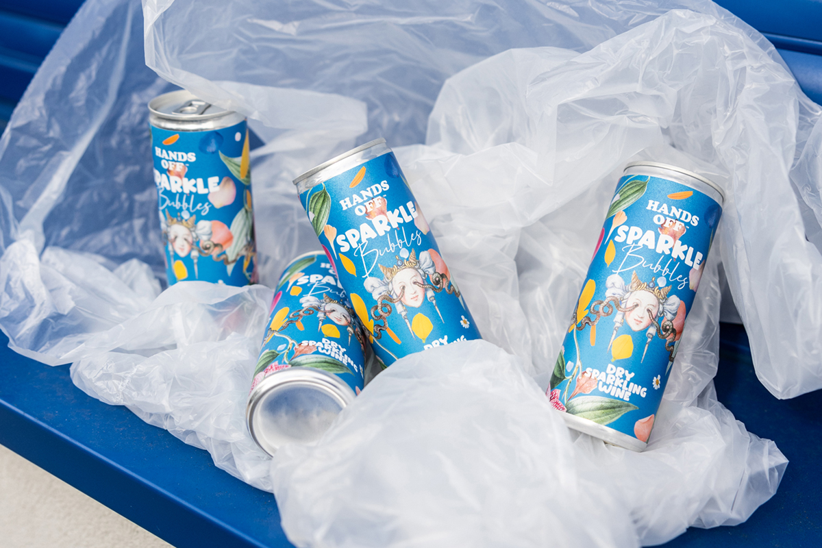
Kingdom and Sparrow’s packaging design for The Roost Winery’s new bottles showcase the Blue Mountains, Canada, where the winery is based. In a region where temperatures can descend to -50 degrees, Roost Winery thrives by cultivating hand-grown and harvested cold-climate varieties. The packaging, designed for outdoor enjoyment, features a hand-painted grape and vine image integrated into a refreshed logo, creating an organic and approachable feel. The ‘oo’ in ‘Roost’ serves as windows for brand identity and information, maintaining a connection to the winery’s natural philosophy. The earthy and natural color palettes echo the winery’s surroundings.

Roost Winery is based in The Blue Mountains, Canada. A beautiful location surrounded by lakes, rivers and hiking routes. But where it can hit -50 degrees – a difficult place to have a vineyard. Roost have successfully developed their own hand grown and harvested cold climate varieties. They came to us for branding for a new product; 200ml bottles ideal for a barbecue, picnic or lakeside lunch.
Get unlimited access to latest industry news, 27,000+ articles and case studies.
Have an account? Sign in