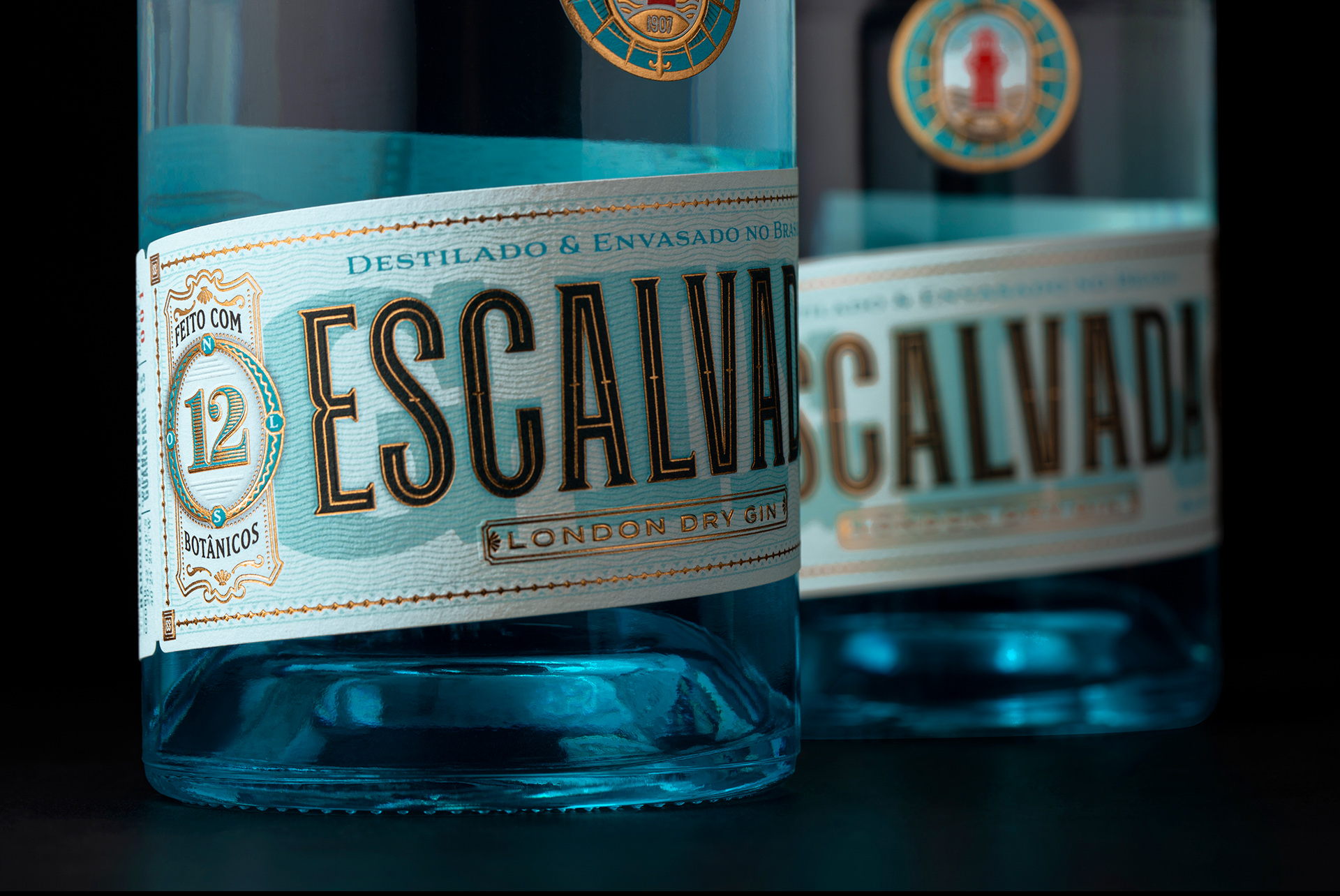
Holy Studio created the packaging design for Gin Escalvada and was inspired by old ferry and travel tickets. There’s a sense of celebration within the bottle design, with an island theme, there’s a hint of vacation splashed throughout the packaging system. The bright blues, golden notes, and blue bottle work together to create a tropical aesthetic that beautifully ties in the ferry inspiration.
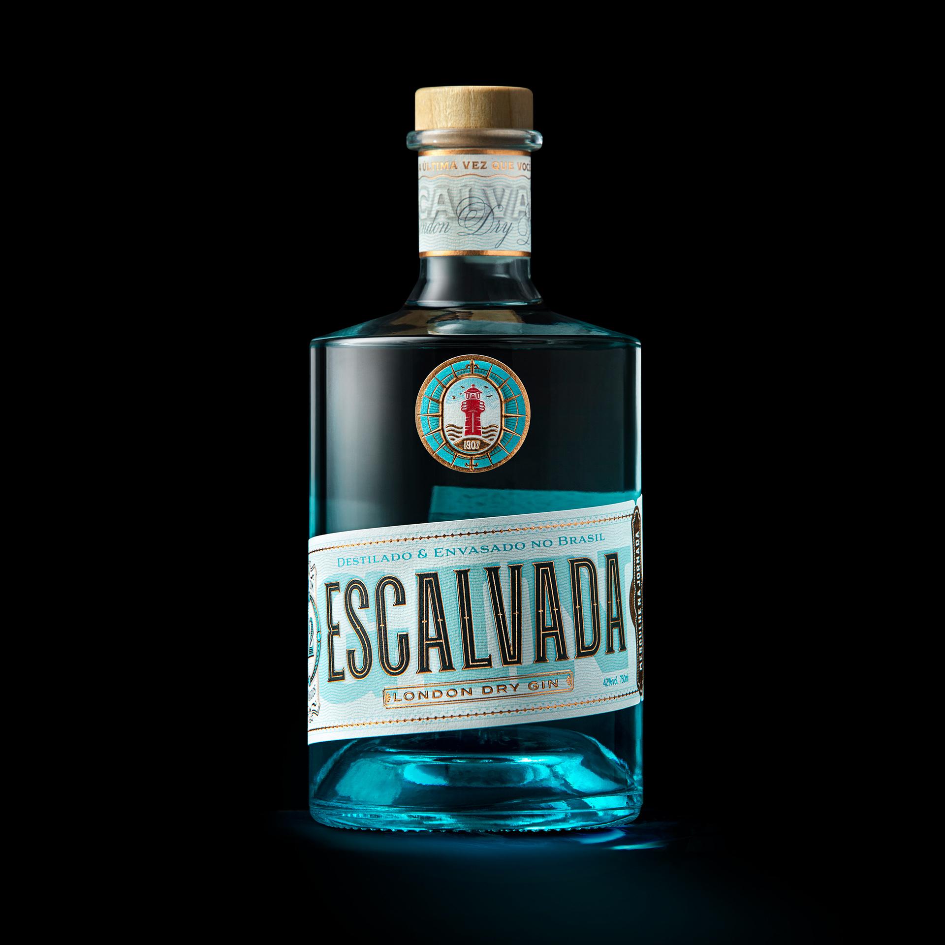
An invitation to dive into your Journey. Inspired by the name and beauty of a famous Island of Espírito Santo, Brazil, Gin Escalvada pays homage to a paradise location on a label inspired by old ferry and travel tickets. In a region rich in diversity and surrounded by exuberant nature Gin Escalvada personifies people looking for moments of relaxation and fun.