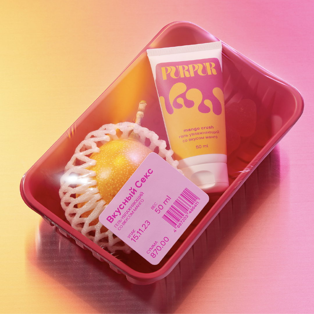
Empowering Transparency through PurPur’s Bold Flavored Lubricants
By
Published
Filed under
By
Published
Filed under
Polina Zagumenova’s packaging design for PurPur’s flavored lubricants stands out with its bold and confident aesthetic. The playful, 70s-inspired typography and vibrant color combinations give the product line a unique and recognizable identity. The design breaks away from bland, secretive aesthetics commonly associated with such products, instead opting for a transparent and empowering approach that encourages consumers to embrace a lube that hides nothing at all. Incorporating bright colors and shapes adds a touch of sophistication to the overall packaging.

Flavoured lubricants for Purpur brand: midnight prosecco, mango crush and brownie fantasy. Bright colors, shapes of texture inside with the feel of taste — just bold and recognizable graphics that make this product line shine like a diamond!
Get unlimited access to latest industry news, 27,000+ articles and case studies.
Have an account? Sign in