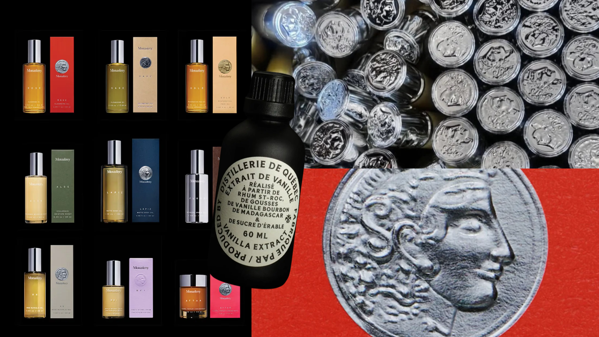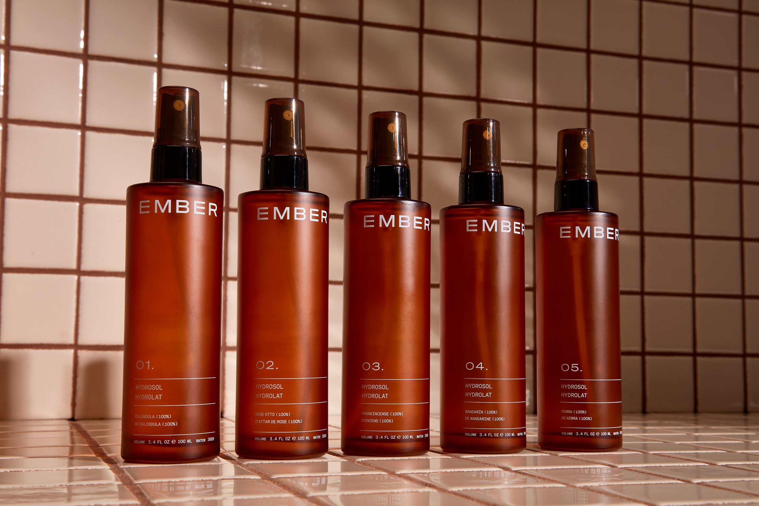
Studio Millie’s team worked with skincare brand Ember to create a packaging design that balances timelessness with a muted, earthy undertone. The amber bottles, paired with white typography, create a nonabrasive energy, perfect for a brand promising to add the ease of cleanliness to consumer’s routines.

Ember Wellness is a thoughtful skincare brand that came to us looking for an equally thoughtful name, design and messaging. From bottle to box, we’ve crafted each element with intention. The Ember team approached the Millie team for a rebrand for their already thriving skincare business, as they wanted a name that spoke to their inclusive nature. With ethical sourcing and traceable ingredients, we wanted to ensure that the brand identity and all packaging materials reflected the business’ core values. All of the assets of the brand work together to create a simple and minimal appearance that will complement rather than clash with natural materials like kraft, cork, and recycled paper. The result of this project is a new name, brand messaging, package design, website design that all work in cohesion to create an upscale, earthy, and, ultimately, thoughtful brand.