Byerlee Design created the packaging for Dichotomy wines. The packaging concept taps into the brand’s name, inspired by the winemaker’s new-age winemaking with contrasting wine regions and varietal potential. Each wine’s label reflects the notes, and the typography highlights the brand’s unique perspective. The details are unmatched, resulting in an exceedingly animated label design.
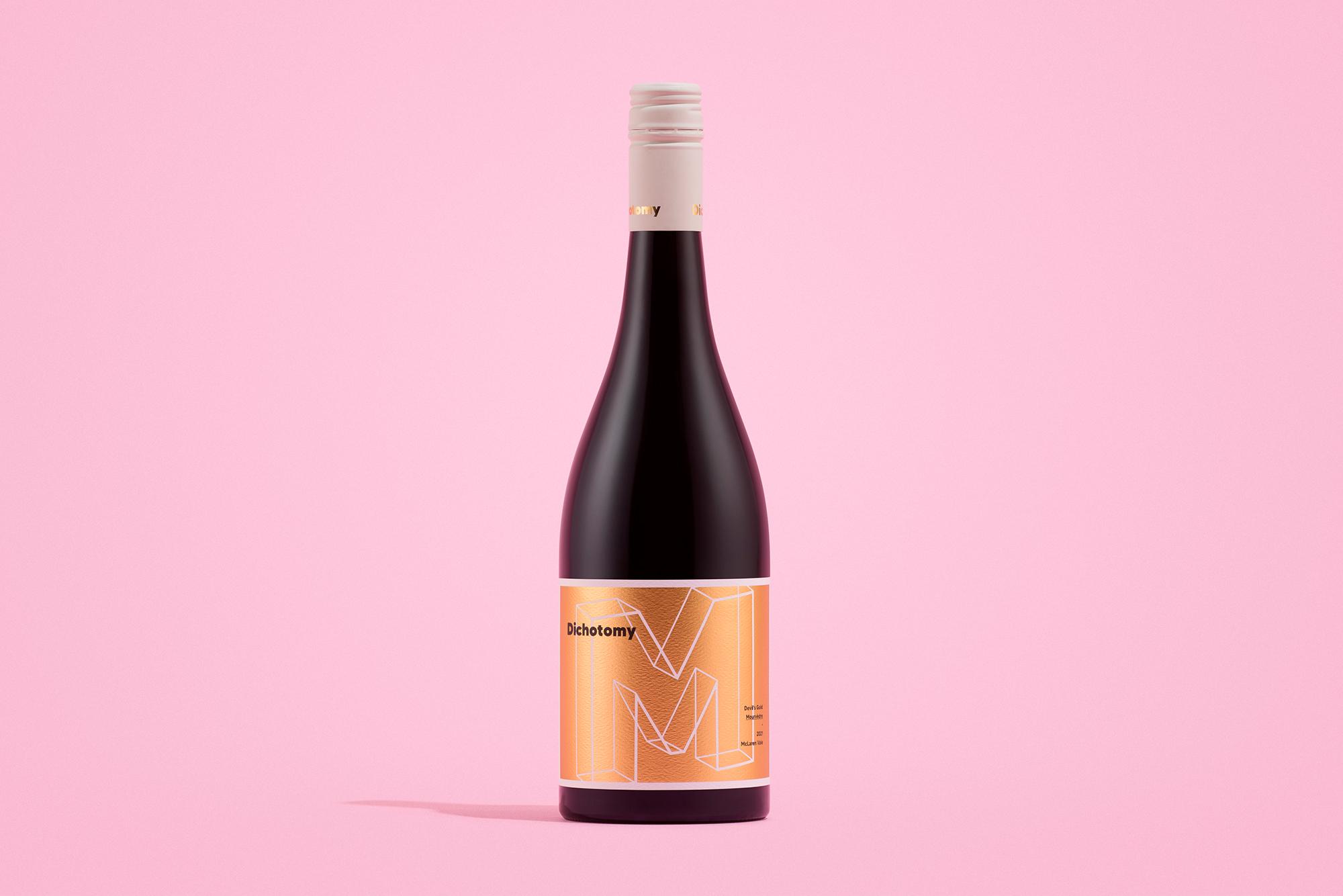
Dichotomous by name and nature, Dichotomy lives by the principle that there is more than one way to pick a grape, proudly showcasing the flavour and structural range of varietals by taking the winemaking road less travelled.