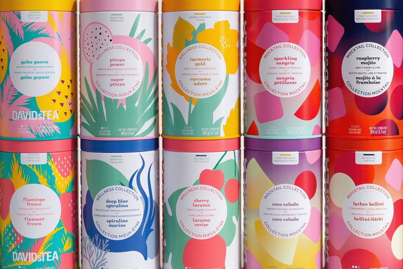
La Famille redesigned David’s Tea’s summer line with vivid colors in mind. The packaging system is bright and cheery but effortlessly continues the brand’s key elements of rounded shapes and typography. Unique color palettes represent each flavor, and while all different, the hues all look stunning as a set.

We revisited the packaging for David’s Tea summer teas to make them stand out while retaining the brand’s key elements—like the coloured round shape and typeface—, which had become signatures of David’s Tea. Brought together under a common theme called Miami, the three summer tea categories—well-being, cocktail, and tropical—had to share a family resemblance while standing out from each other on the shelves.