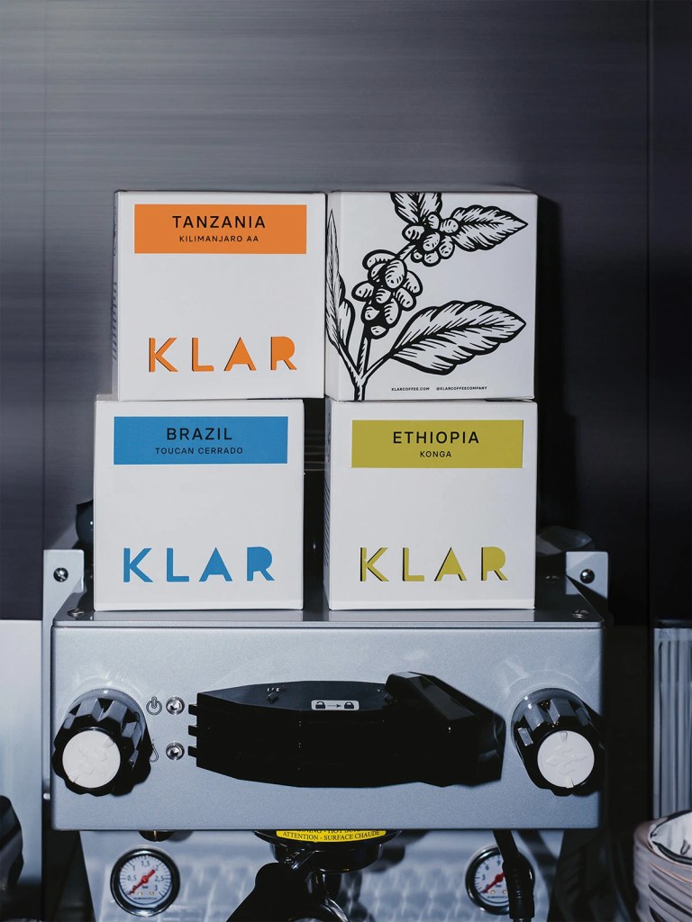
KLAR Coffee’s packaging is clean in design and confident in minimalism. Designed by Ceren Burcu Turkan, each SKU has its own bold color block and oversized stencil-style type that punches through the white background with cutout lettering. It feels crisp, intentional, and super shelf-friendly, especially with the addition of graphic black botanical illustrations. The design plays with repetition, symmetry, and contrast, making even the quietest countertops feel curated.