Studio Miles designed Pot-De-Vin’s cider packaging with a quirky personality at the forefront of the design. From the vivacious color palettes to the charming typography to the lovely illustrations, the cider’s label is highly unexpected but creates an all-consuming ambiance. With certain nods to the stereotypes of shenanigans and bribes, the bottle’s design exudes a playfulness with which only a friendly bet can ooze.
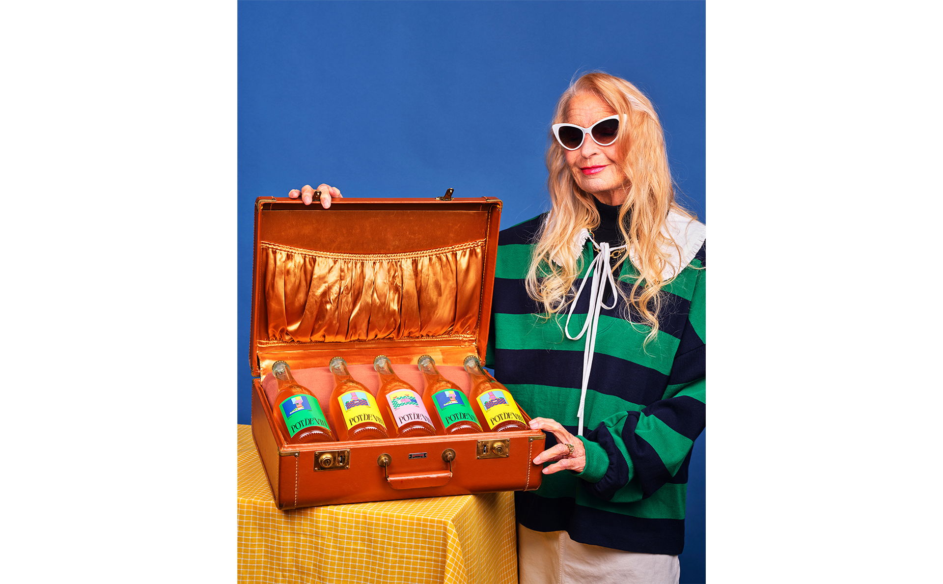
Each year, to thank our customers for their trust over the past year, we create a new and unique surprise for them. This is a golden opportunity for our team to fully unleash their creativity in a project without constraints. However, few customers are forced to refuse our little attention, for fear of bribes. Finding this situation a little crazy, we seized this occasion to make it the genesis of this project.