THIS IS IT! DIELINE Awards 2026 Late Entry Deadline Ends Feb 28
‘C’ is for Beer: Auge Design Brews Up a Bold Identity For Castello
By
Published
Filed under
By
Published
Filed under
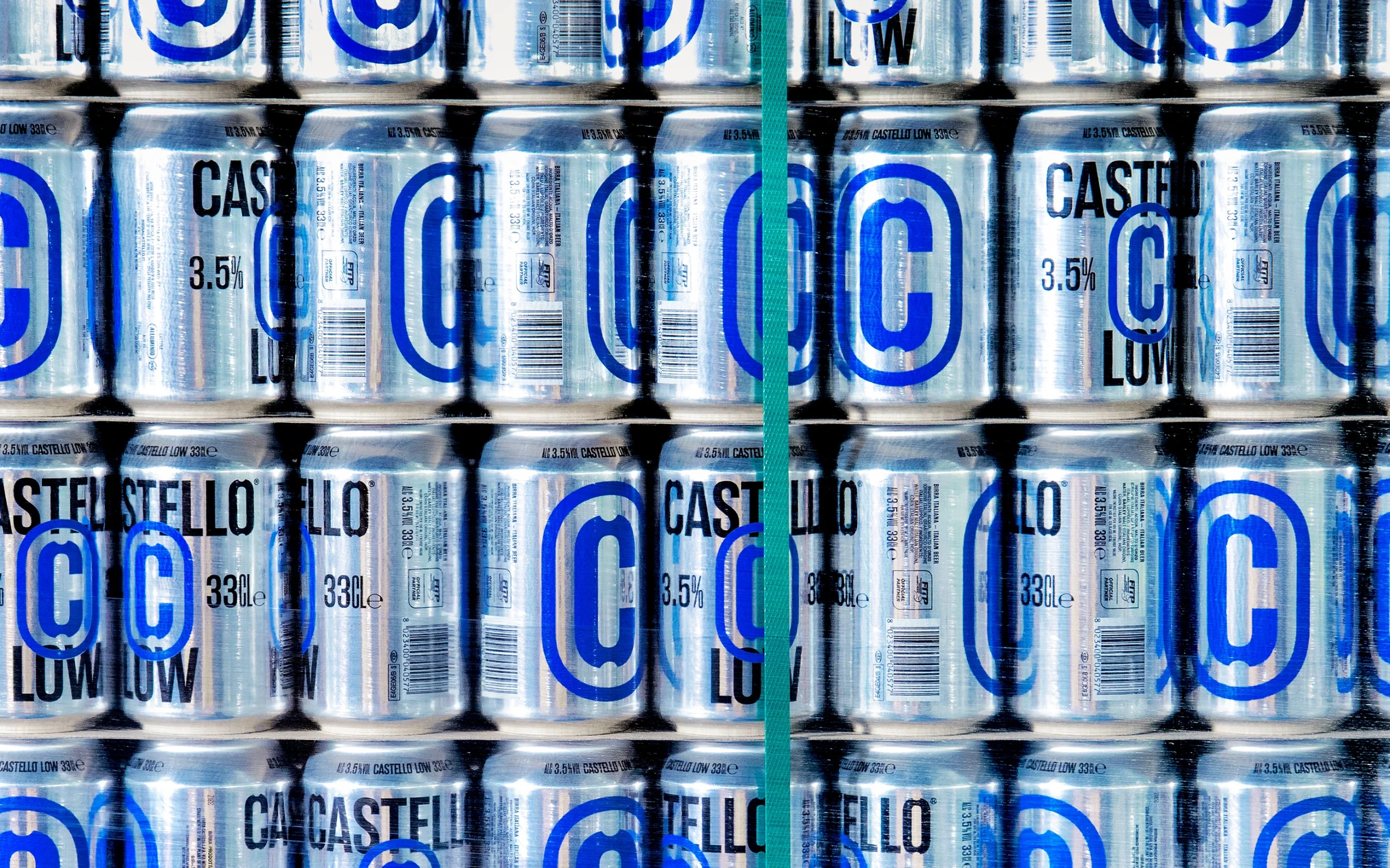
Birra Castello’s identity leans on a single oversized C that functions almost like industrial signage.
Auge Design uses the letter as an anchor, scaling it across cans and bottles so it reads instantly from a distance. The electric green and blue accents cut sharply against the aluminum and dark glass, giving the lineup a high-visibility energy. The result is a system that feels engineered for shelves, stadium coolers, and anywhere else attention is up for grabs. It’s editorial and high-energy, yet manages to be elevated and sleek.
Andrea Mastroluca, Associate Creative Director of Auge Design, gives more insight into the design process below.
Get unlimited access to latest industry news, 27,000+ articles and case studies.
Have an account? Sign in