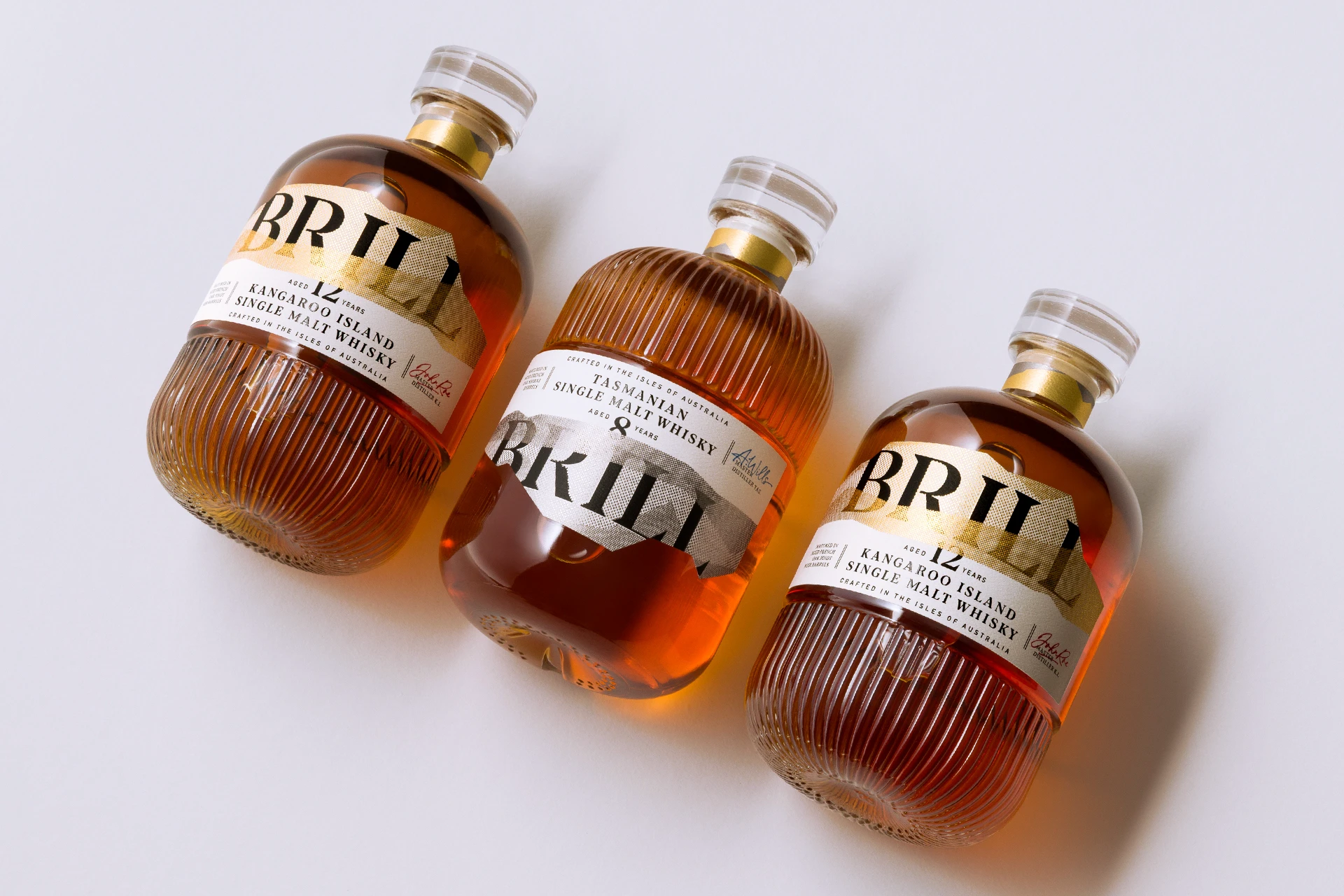
Brill by Harcus Design takes whisky packaging in a crisp, tactile direction. The golden hue of the liquid becomes part of the palette, paired with white textured paper, black type, and flashes of metallic gold that echo a sense of sunlight, refinement, and the remote landscapes of Tasmania and Kangaroo Island.
The irregular label shapes quietly reference each island’s topography, while ribbed glass creates a horizon across the bottles, giving the two expressions a clever visual relationship. Oversized serif lettering slips behind and across the label shapes with an editorial confidence, bringing a modern fashion sensibility to a spirit usually surrounded by crests, scripts, and dense storytelling. There’s a current shift toward material-driven luxury, where unusual structure, touch, and restraint can tell a richer story than decoration alone, and this design certainly falls into that.