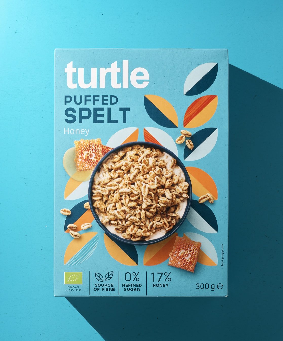
Cereal is a staple breakfast, no matter your age, and Quatre Mains’ packaging design for cereal brand Turtle proves just that. Although these cereals are low in sugar and high in fiber, making for a healthier cereal option, the packaging has found a balance of showcasing the health benefits while also mixing in a sense of playfulness through bright colors, gorgeous photography, and enchanting illustrations. The only question left to answer is this: do you put milk or cereal in the bowl first?

Turtle and their deliciously innovative family of cereals just keeps on growing. True to form we were again asked to stretch and diversify the Turtle packaging identity to accommodate the introduction of a range of Healthy Classic cereals to their product portfolio.