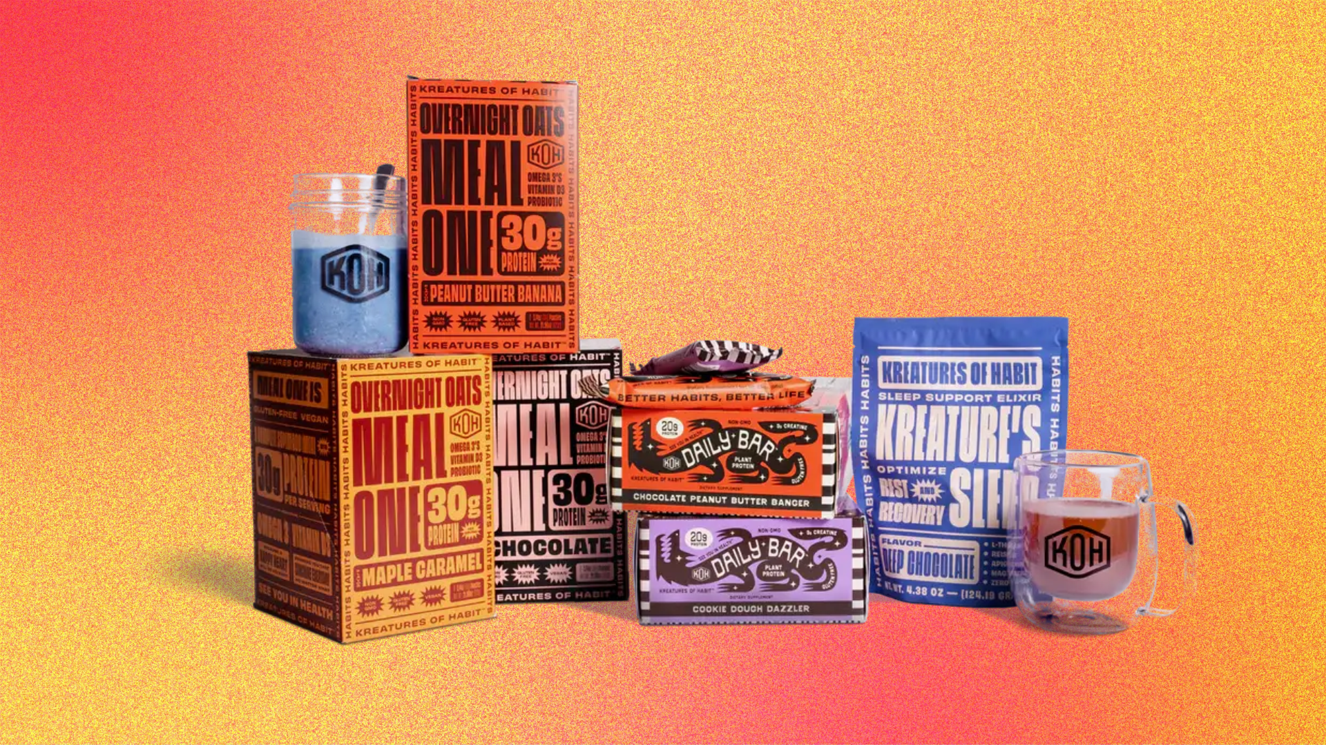
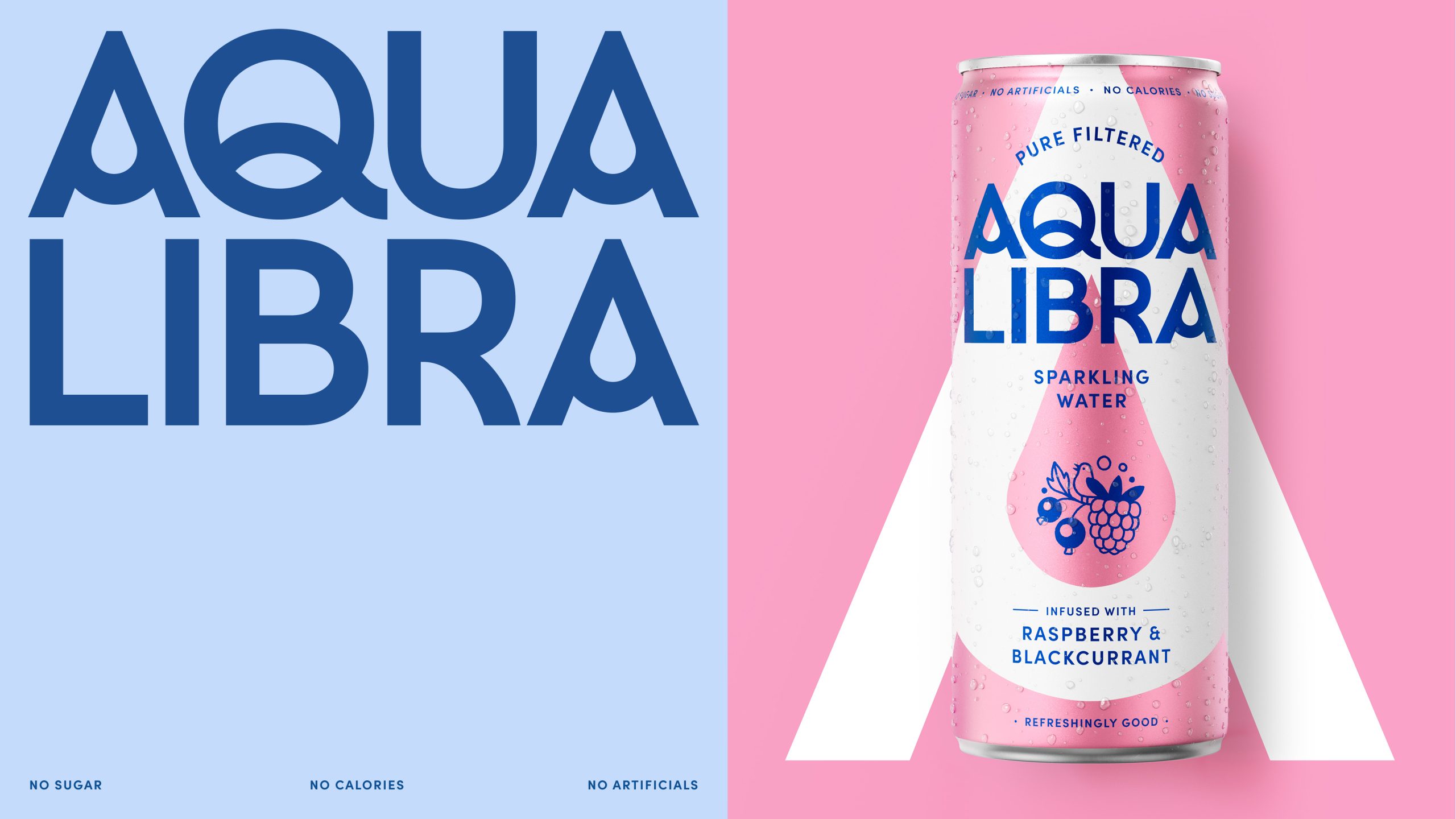
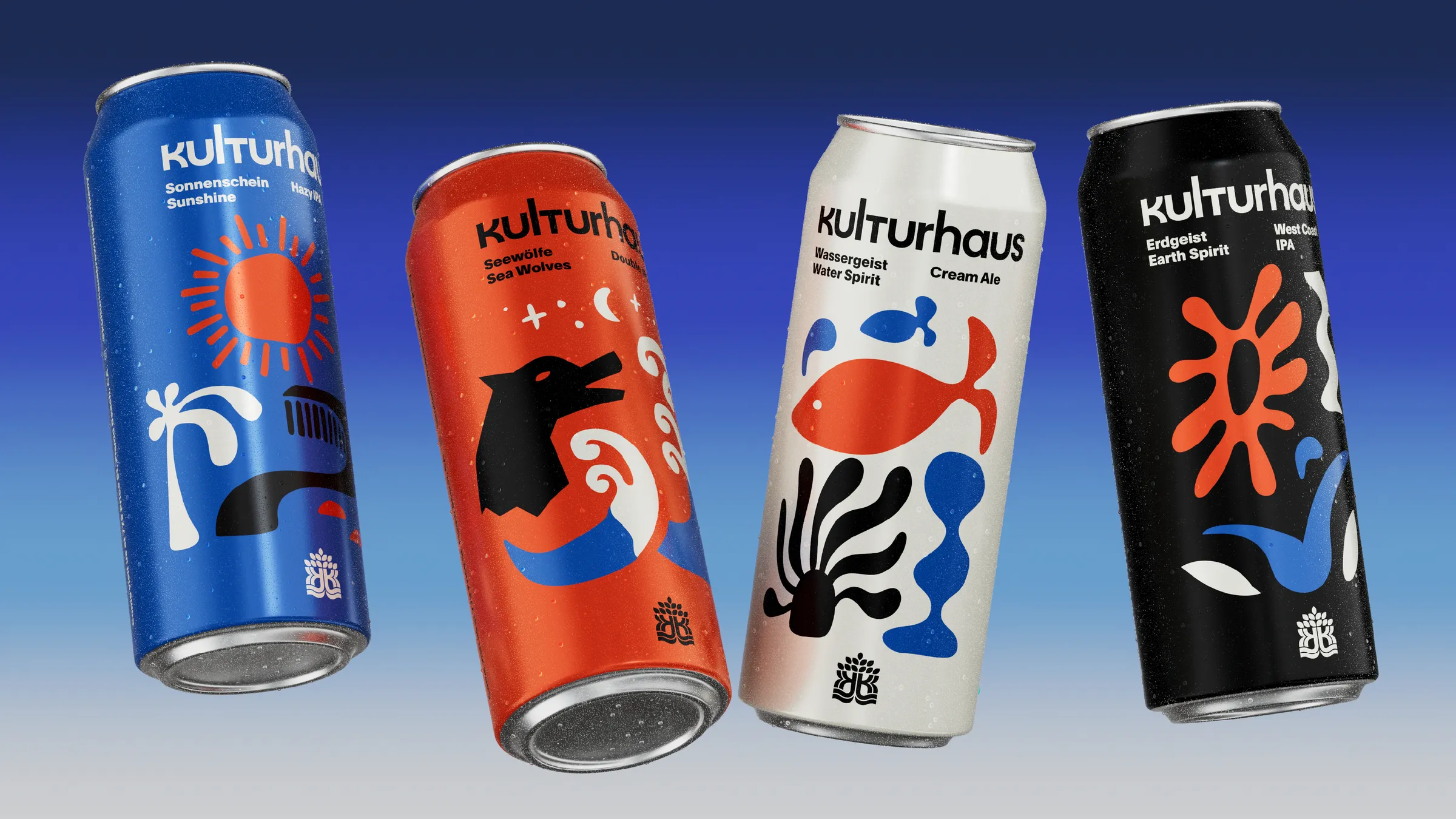
The irreverence is shining on Goshen’s packaging system designed by TOKY. The brand’s name, a mashup of the words “Good Shit Energy,” combined with the magnificent typography and glowing color palettes, creates a packaging system that absolutely stands apart from the masses. While the system leans into maximalist cues, there’s still plenty of white space to keep the overall aesthetic feeling balanced and crisp.

Twenty years of masterfully roasted coffee had earned Goshen a loyal following and plenty of potential to expand. What they lacked was a visual identity that resonated with their audience — and a brand idea to inspire it.

