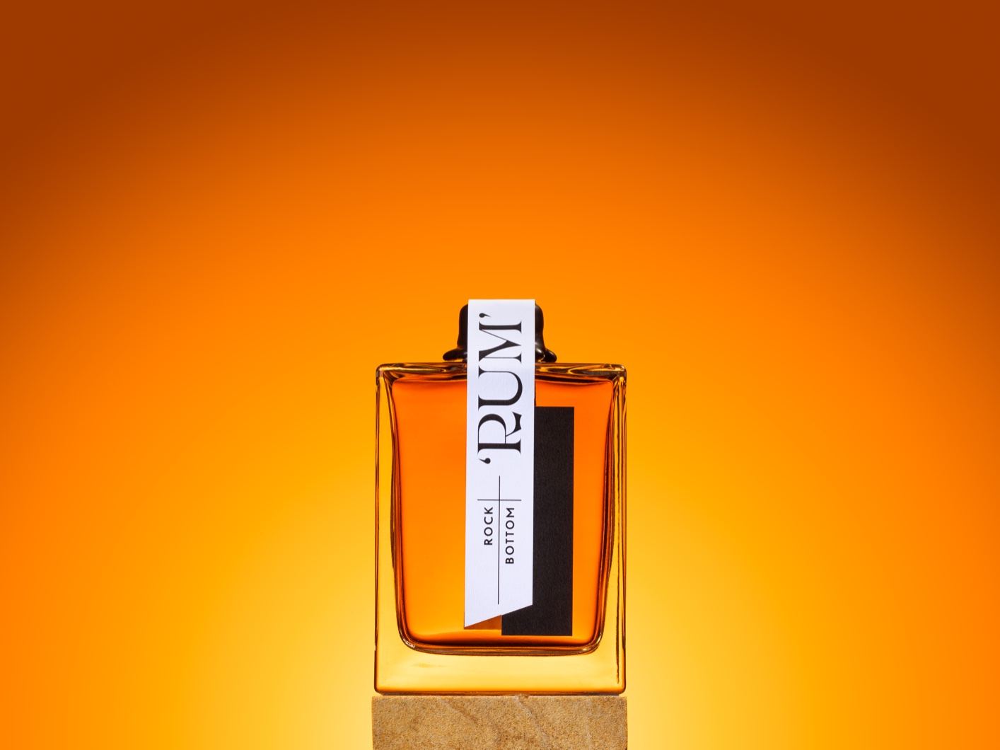
DIELINE Awards 2024 – EARLY BIRD ENDS THURSDAY
Featured image for MONA's Rock Bottom Rum

MONA's Rock Bottom Rum

by Chloe Gordon on 04/12/2023 | 2 Minute Read

MONA's Void Bar created its rum, and the packaging system is sleek and sophisticated. Because sandstone is rooted within the brand's foundation, a piece of sandstone is affixed to the bottle's base. And beyond the bottle's elegant structure, the label is interesting because it's attached across the top, creating a new way of viewing a bottle. The right amount of distinctive styles allow this brand to stand out.
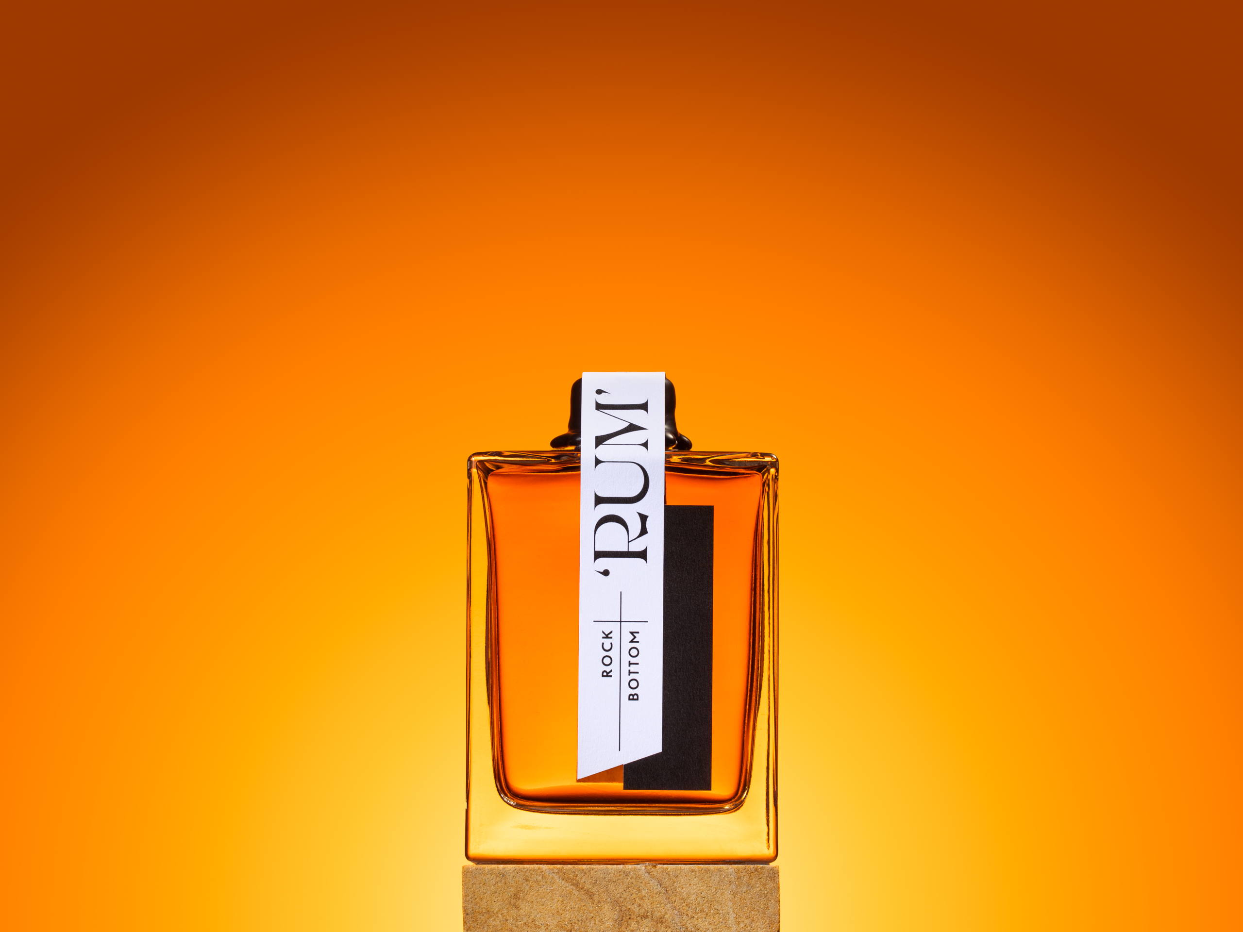

1 RBR_H_2.png

The Brief: packaging design for a 'rum' for MONA's Void Bar. The bar sits at the subterranean base of MONA, cut out of the sandstone rock the museum sits on. The packaging for this tiny bottle should be premium, and tie into the Void bar branding – a long black vertical rectangle – utilize the sandstone, and the general dark vibe of MONA. On a shoestring budget.

The Solution: an oversized tamper-proof seal label, to not obstruct the view of the golden- coloured liquid within. The Void bar logo is incorporated into the seal. The typography for 'RUM' evokes a pirate feel with its cutlass-esque 'R' as a nod to the origin and mythology of rum, and to MONA as a rebel brand. The bottle has an actual piece of sandstone affixed to its base; echoing the Void bar at the bottom of the sandstone museum, a literal rock-bottomed rum. A custom slide-box was produced to both enhance the premium quality of packaging and for safe shipping.

2 RBR_H_3.png
3 RBR_V_3.png
4 RBR_H_1.png
RBR_V_1.png
RBR_V_2.png
RBR_V_4.png