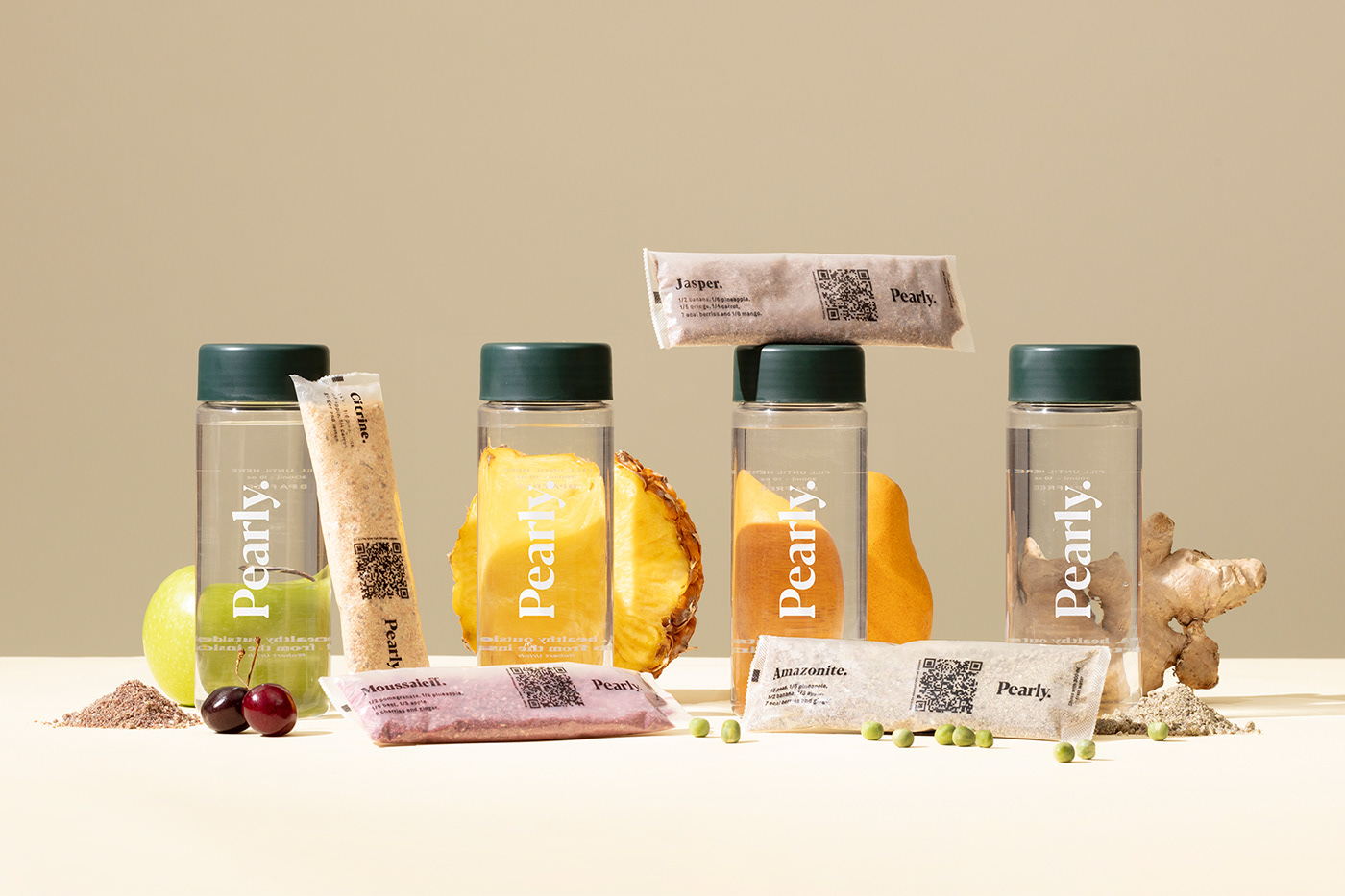
Health is wealth, and Pearly is a plant-based nutrition brand for the modern age that’s proving it. The superfood organic smoothie brand worked with the branding people to develop a packaging system that represents the brand through vibrant design. Allowing the earthy colors from the products to shine through, the use of translucent pouches enables the hues to stand out. Additionally, the sheer pockets showcase the powdered pearls, creating a packaging system based on the gorgeous product itself.