Reimagining Setu And Releasing The ‘Medicinal’ Baggage
By
Published
By
Published


Setu is a supplement-nutrition based brand selling high-quality products using clinically validated ingredients. They understand that health isn’t easy, therefore they make supplements that make sense with a bit of a personal touch.
In such a health forward category, the ‘medicinal’ baggage getting attached to the brand is almost a given. Considering the brand wanted to add a more approachable touch to its identity, the usual visual language of a health-related brand had to be challenged. Their products are tailor-made, keeping in mind the interests of their consumers. Hence, they needed a visual approach to their packaging which was exciting and comfortable.

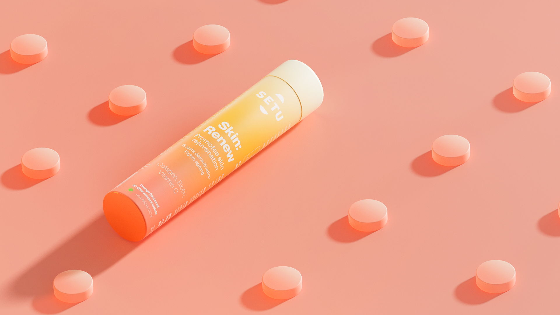
How did we tackle it? We borrowed from engineering diagrams, blueprints, and schematics to highlight the ‘background workings’ of our products. The idea was to let the packaging itself speak for the product and put its attributes at the forefront.
Our powerhouse behind its identity is a uniquely crafted colour palette. The benefits of each product were visualised as a soft perpetual gradient but the inside was inspired by schematics packaging. Different colours corresponded to different after-effects while adding lightness to an otherwise boring blueprint.
With the colour palette being at the forefront of our approach, choosing an accurate brand colour was of utmost importance. Therefore, we turned to Living Coral for our brand colour.
The newly employed strategy for Setu’s identity and a nuanced play with the colour palette helped Setu get rid of the ‘medicinal’ brand baggage. The packaging helped the brand have a long-lasting visual imprint among their potential consumers, thus standing out not just for their extraordinary benefits but also for the visual appeal.
It is a mix of red and orange with a golden undertone which energizes the colour while having a softer edge. It is perceived as a warm and dynamic colour that symbolises being part of a greater humanitarian consciousness, something which is more beautiful and bigger than you and me.

Moving forward, due diligence was given to typography and iconography. They were essential elements that would enhance the overall impact of the transformation of the products’ packaging. Neue Montreal was selected as the rightful type family for the new identity. Its soft edges provide certain ease and comfort to the eye while the font in its entirety makes a statement. Unique icons were developed to give a distinctive identity to the products, along with the gradients. The icons were kept basic and simple to give an insight into the category while making them customer-friendly, for instance, the icon for ‘Nourish skin from within’, has a sparkle-like shape to denote the radiance and the one for stress shows turmoil getting transformed into zen mode.
The products have been personified through a distinct colour palette. The ease with which the colours blend together to form gradients for every product makes the packaging pleasant yet unique to look at. Various gradients have been used to give a unique ‘visual shorthand’ while still keeping it within our brand structure. They aim to exemplify the characteristics of the product. For instance, deep, peaceful sleep leads to waking up feeling fresh and rejuvenated, hence, a gradient of drowsy deep purple has been used to indicate the cycle of a deep slumber to a bright, radiant day. Similarly, for hair products, a gradient of dull lifeless grey to shiny, healthy jet black has been used to signify different personalities of hair that exist.