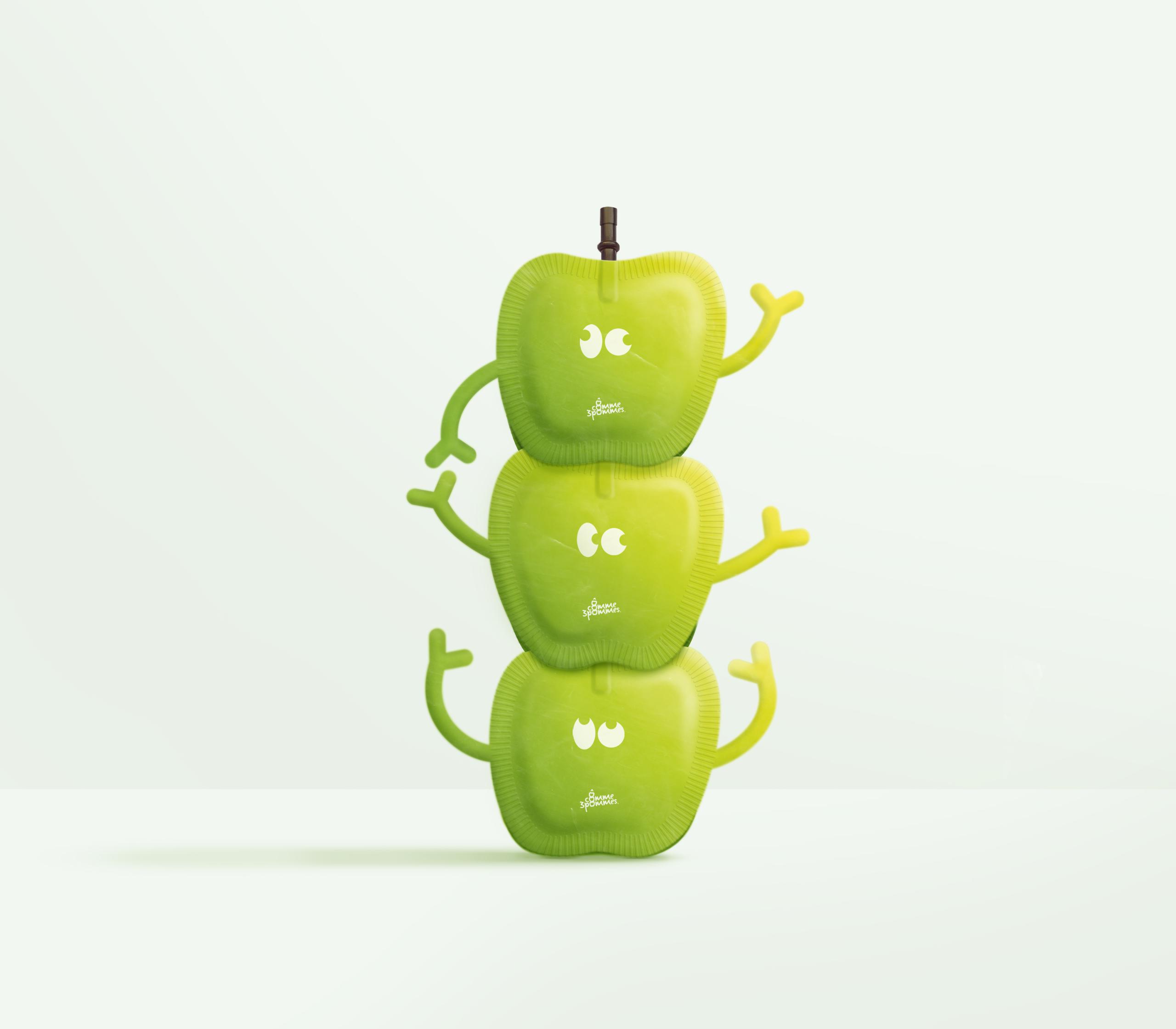
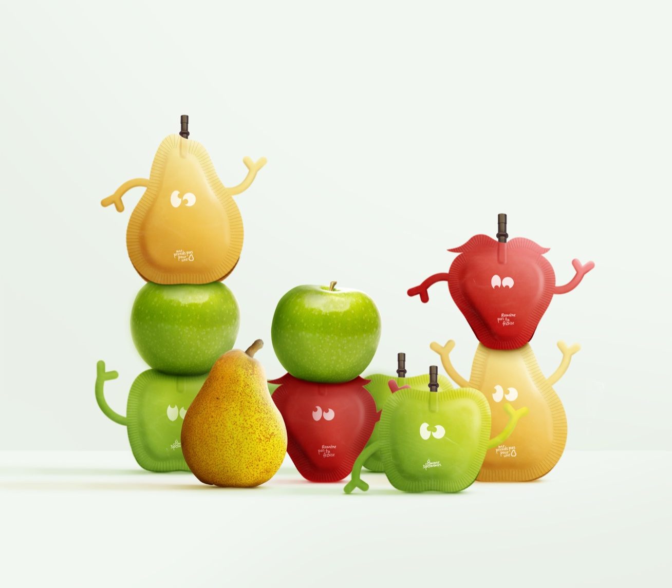
Featured image for Student Week: Ô comme trois pommes

Student Week: Ô comme trois pommes

by Chloe Gordon on 08/27/2021 | 3 Minute Read

If you're a parent or happen to find yourself around kids, you know that squeezable snack pouches are in. Following this trend in snacks, Mattéo Tabutieaux designed the packaging for snacks "Ô comme 3 pommes", “ Ramène pas ta fraise“ and “Me prends pas pour une poire."

Each snack's packaging is shaped like the fruits within, yet the arms and eyes create characters from these otherwise mundane fruits. Even if you're never around kids, it's not hard to see how they might enjoy one of these quirky pouches. It's clear that Mattéo knew his demographic in regards to this project.


Editorial photograph

“Ô comme 3 pommes“, “Me prends pas pour une poire“ and “Ramène pas ta fraise“ are product names for a French brand of children's compotes. Coming from popular expressions, they are often heard by children as for example "Haut comme trois pommes" (high as three apples) designating the latter. This touch of humour from the brand allows it to communicate simply about its products so that children understand better. On the Ô comme trois pommes pictogram alone, arms give energy and make them more expressive. These small stacked apples are enough to understand that this is an apple-based product for young people. The typography used in the logo gives the impression that it was written by the child himself and is therefore linked to his daily life (learning cursive writing at school). The whole has a strong personality that allows it to stand out from the rest and to develop a recognizable universe at first glance.

Here are three product names "Ô comme 3 pommes", “ Ramène pas ta fraise“ and “Me prends pas pour une poire" for a compote brand. Their names are taken from French humorous expressions such as "être haut comme trois pommes" (to be tall like three apples), which refers to a child's short stature. The packaging of these products takes the shape of the fruit and is assembled in groups of 3 (or more) by means of a straw symbolizing a fruit stalk that fits together on the underside of each package, its separation recreates the sensation of picking a fruit. The shape of the container allows instant identification of contents. Arms and eyes added to the packaging give life to playful characters for children. As compotes are often snacks at school, I chose to put games on the back to distract them during a school break. These little compotes play with our curiosity and encourage us to discover them.

Editorial photograph