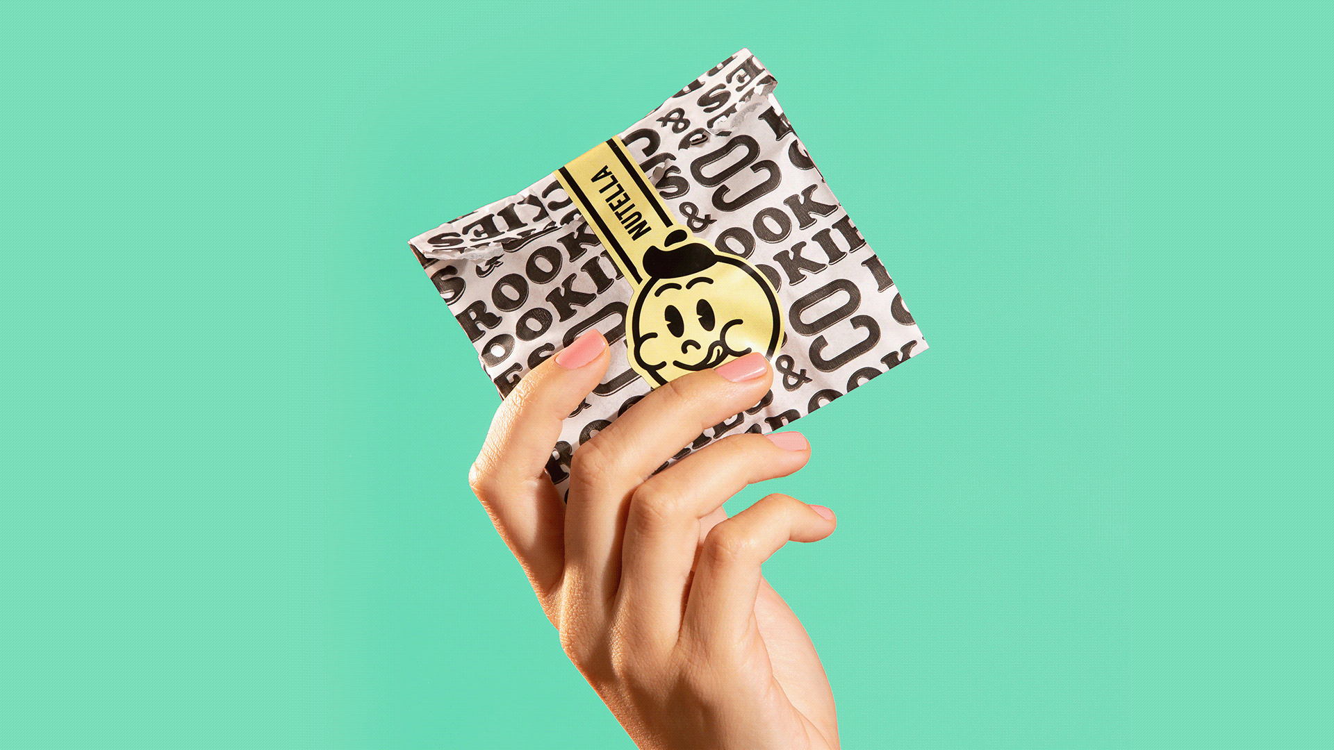
DIELINE SHOP - ALL HATS 10% OFF THIS WEEK ONLY
Featured image for Brookies Packaging Is As Sweet As It Gets

Brookies Packaging Is As Sweet As It Gets

by Chloe Gordon on 07/15/2021 | 2 Minute Read

If you've never had the pleasure of tasting a Brookie, a brownie, and a cookie in one, you're severely missing out. Biting into one is like biting into a piece of heaven.

The pillowy texture and the rich nostalgic flavors make for the perfect sweet treat. With branding and packaging designed by Blank Design Studio, Brookies, the Brazil-based sweets and coffee shop has created an irresistible identity system. The vibrant color palette paired with the 1950s-inspired illustrations and typeface makes for a sweet escape.


Editorial photograph

Brookies is a brand specialized in the artisanal manufacture of brownies, cookies and coffees located in Porto Alegre, Rio Grande do Sul, Brazil, whose mantra is to bring people happiness through their sweets. The briefing demands a clearer and more solid brand positioning facing a new moment of the brand, which is expanding to new commercial spots and a future franchise project.

Through the positioning strategy, we identify territories and differentials to explore in the minds of already fanatical Brookies customers. The good and warm nostalgia. Guided by this concept, a vibrant color palette and the "baking good times" tagline, we created an authentic, global, urban, fun platform with a touch of acid humor brought by its new symbol, inspired by the 1950s cartoons that explored an atmosphere of cunning and malice through their exaggerated and flashy expressions. A project as delicious as the best cookies in town.

Editorial photograph