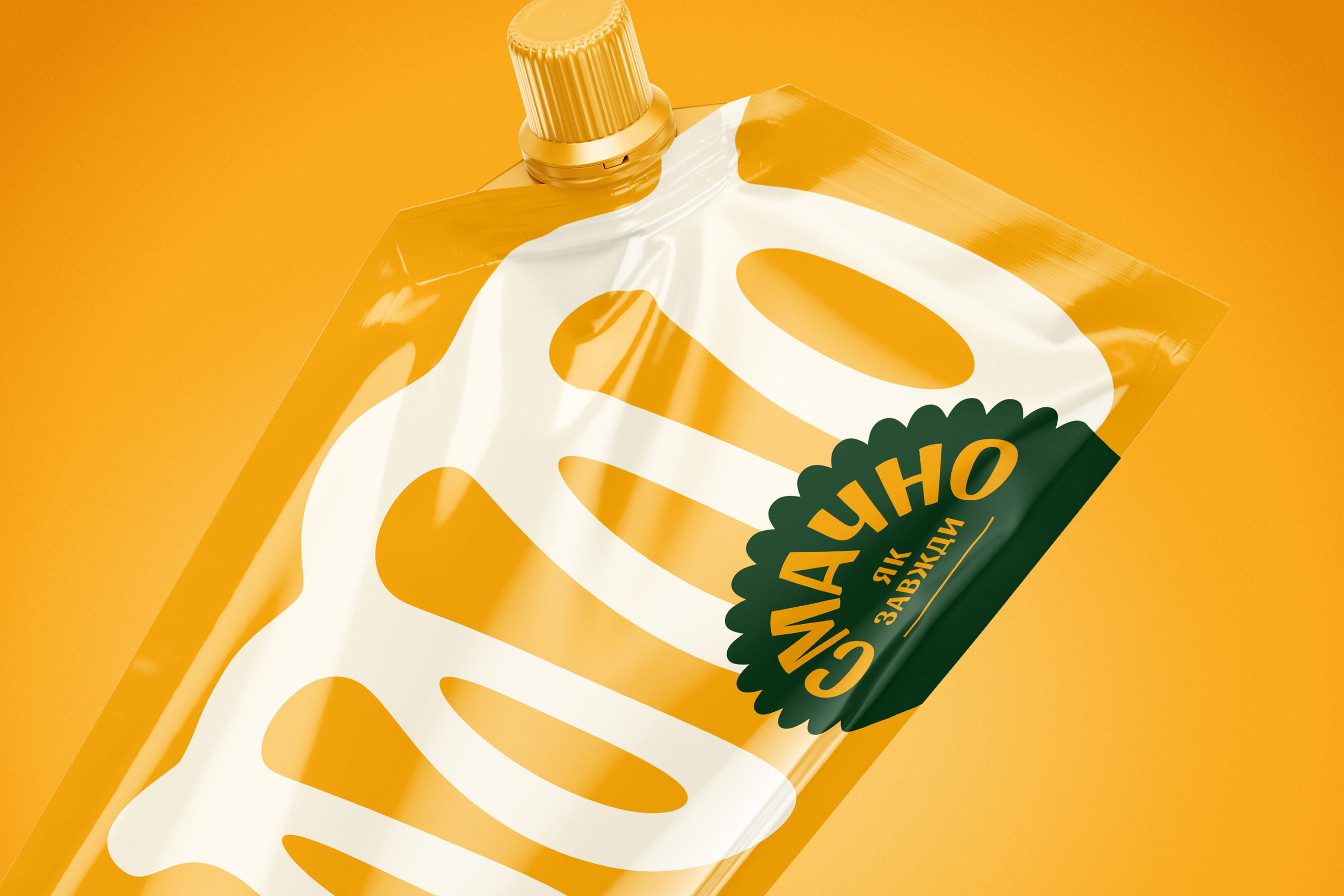
Gutsulyak.Studio developed a visually appealing brand identity for Tasty As Always. Incorporating swirls of white, representing the mayonnaise itself in the logo, and bold colors, they designed a simple, yet playful look. The hunter green, floral logo highlights the natural ingredients, while creating an easily identifiable face for the Tasty As Always brand.
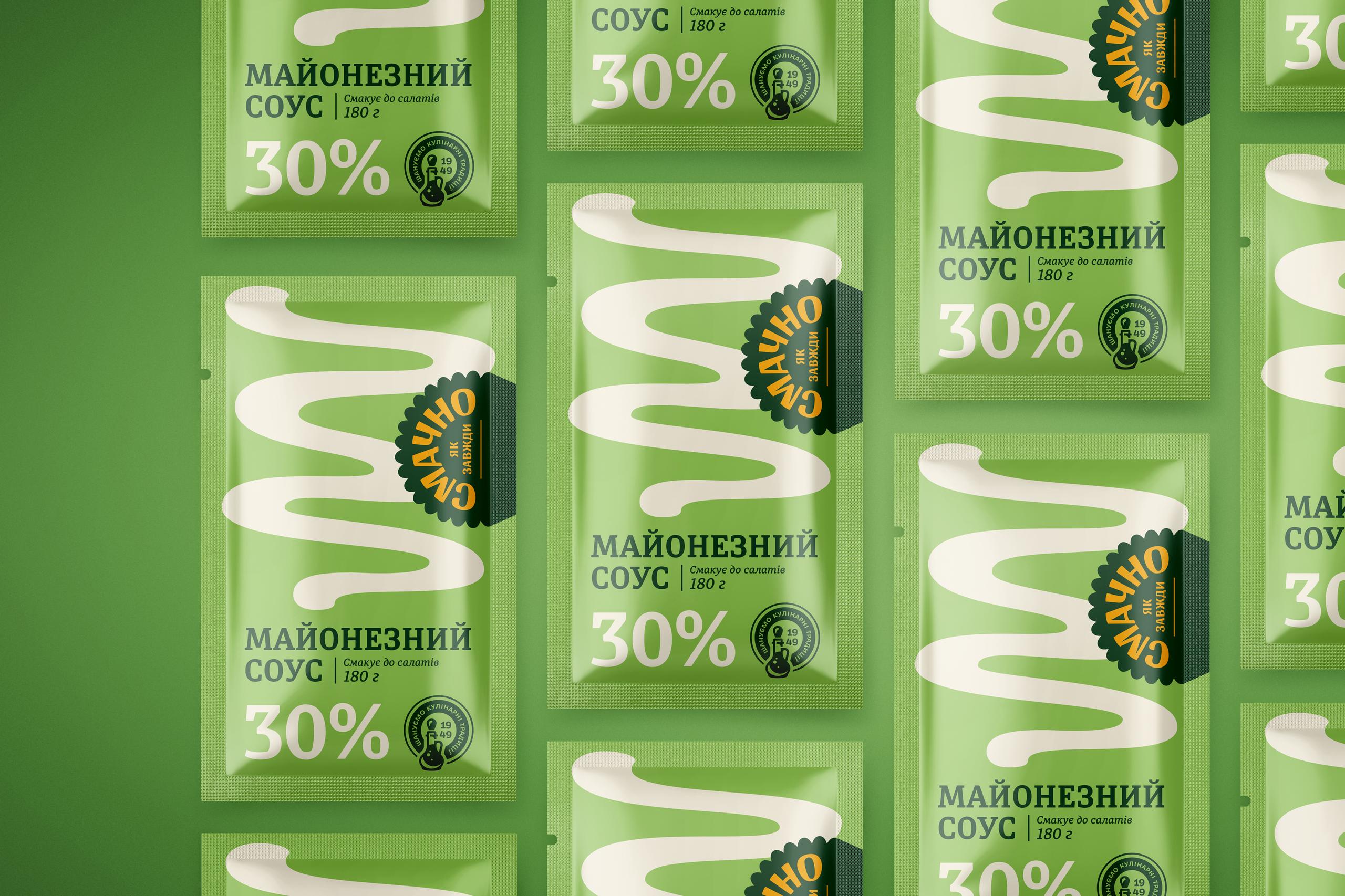
Tasty As Always is a junior brand within Olkom. Based in Ukraine, throughout fifteen years, it has gained popularity in a low-price segment and offers inexpensive yet delicious sunflower oil-based products. We were commissioned to rethink and update the overall brand appearance starting from the mayonnaise sauce series.


