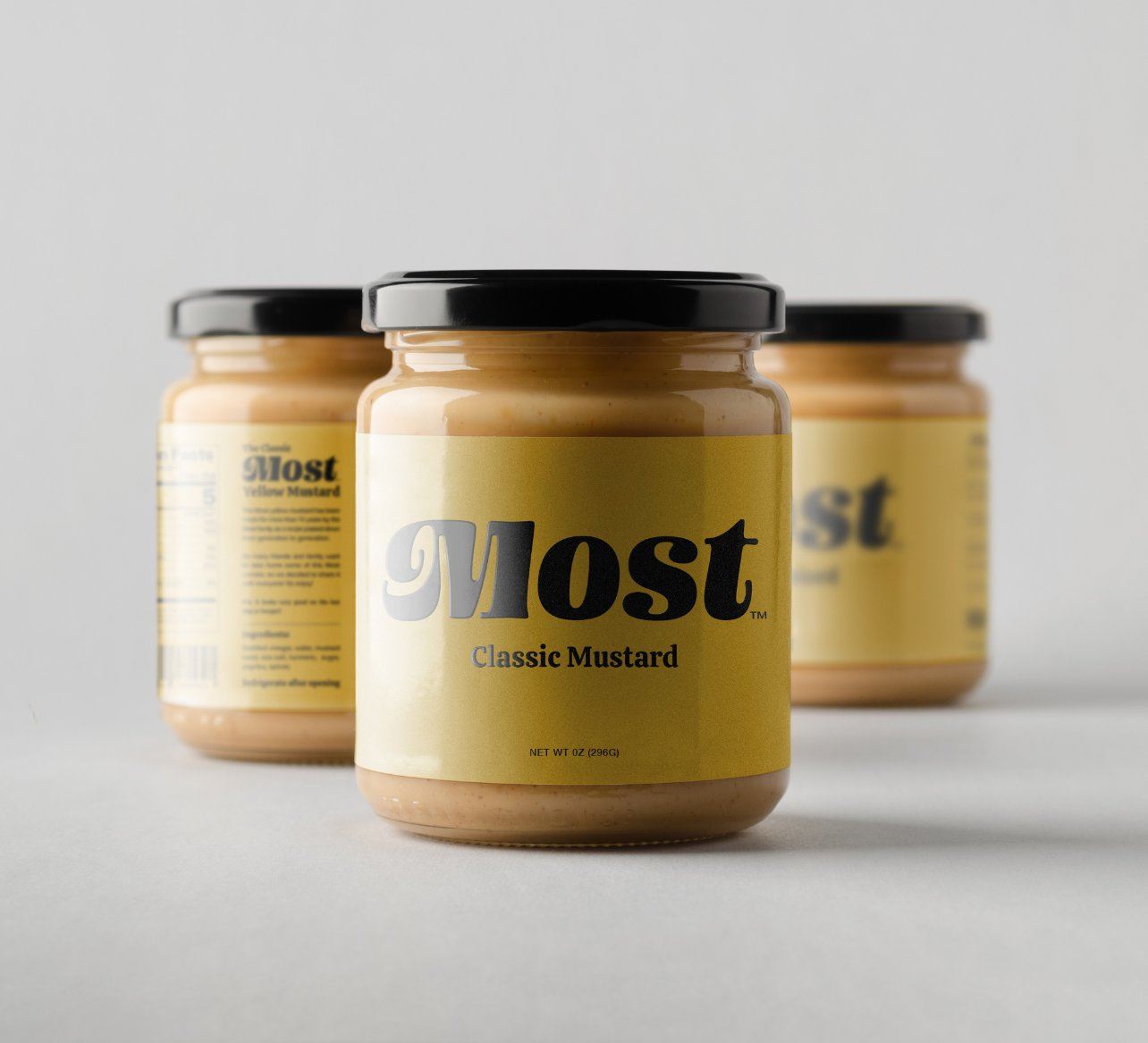
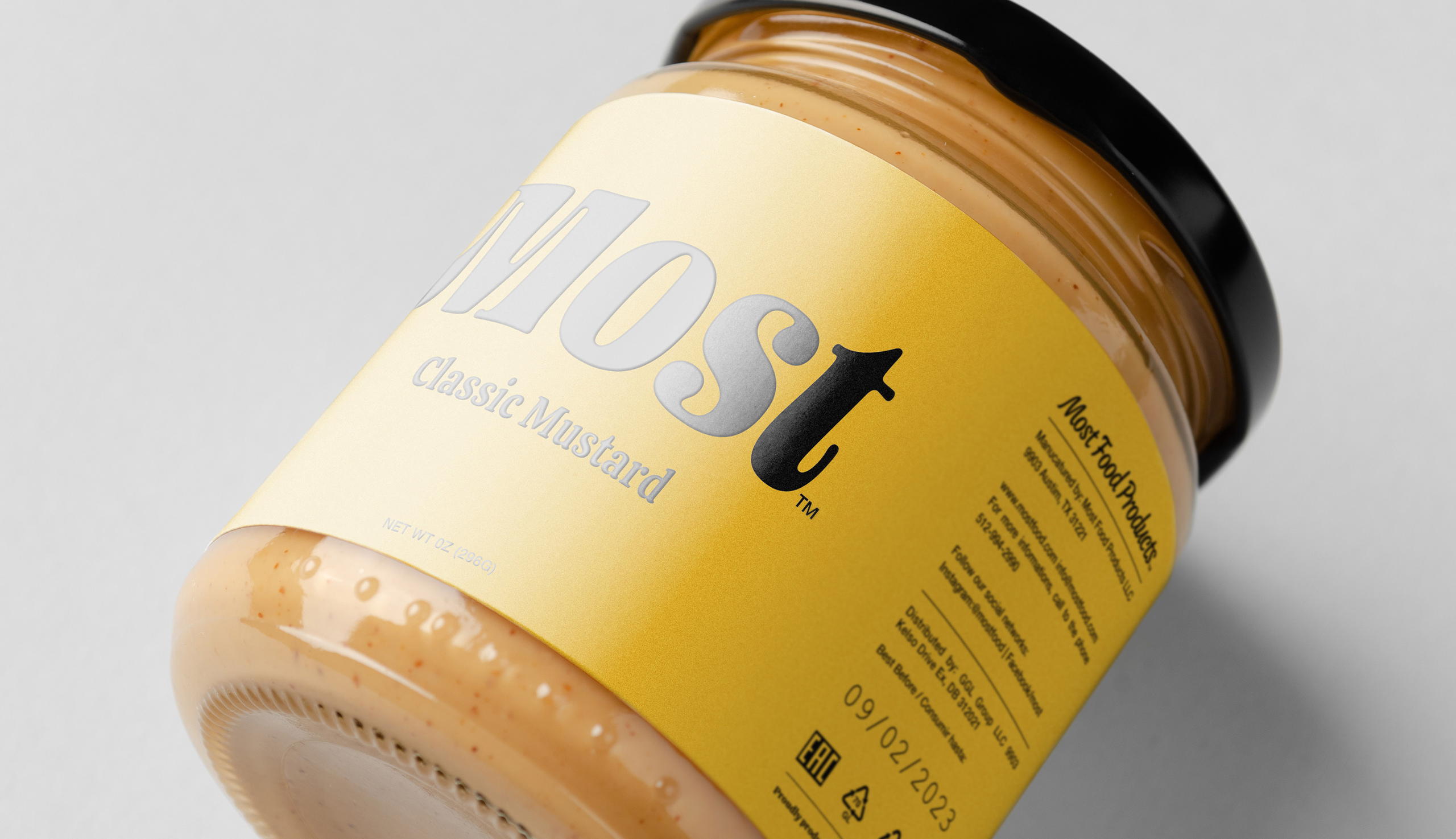
Most Classic Mustard contracted Léo Tavares to create its brand identity. Focusing on, of course, the color yellow as its main hue, the designer broke it down to its simplest form. Accompanied by a curved and funky font, the label is nothing if not straightforward, lacking any distractions. A brand with a history needed to be easily identified, and for this reason the simplicity brought out by the yellow and black serves its purpose.
Most™ Classic Mustard has been made for more than ten years by the Most family, using a recipe passed down from generation to generation. Because so many friends and family members wanted to take the mustard home, the family decided to turn it into a product.