THIS IS IT! DIELINE Awards 2026 Late Entry Deadline Ends Feb 28
Storypoint Wine Invites You To Spill Your Secrets
By
Published
Filed under
By
Published
Filed under
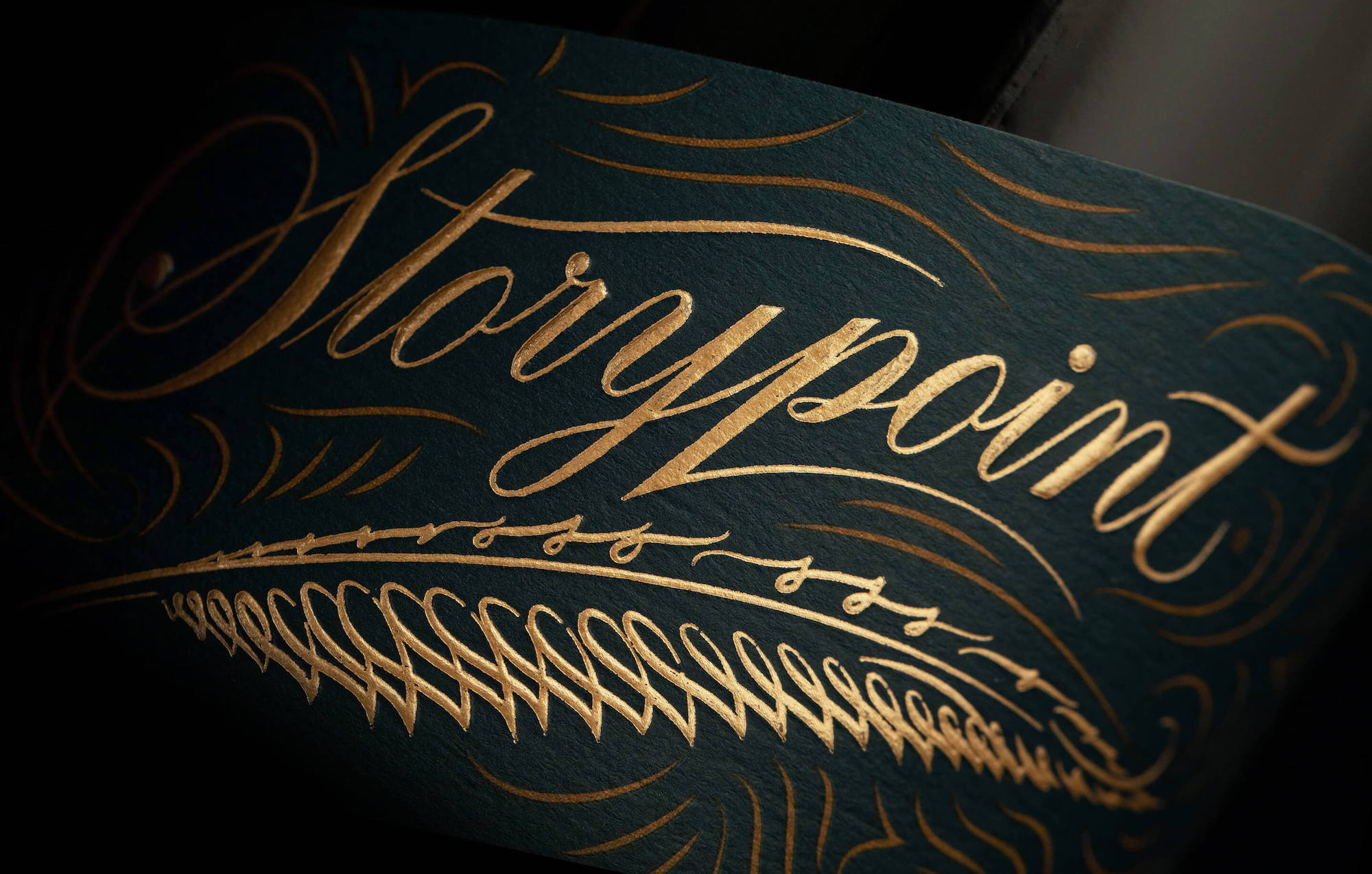
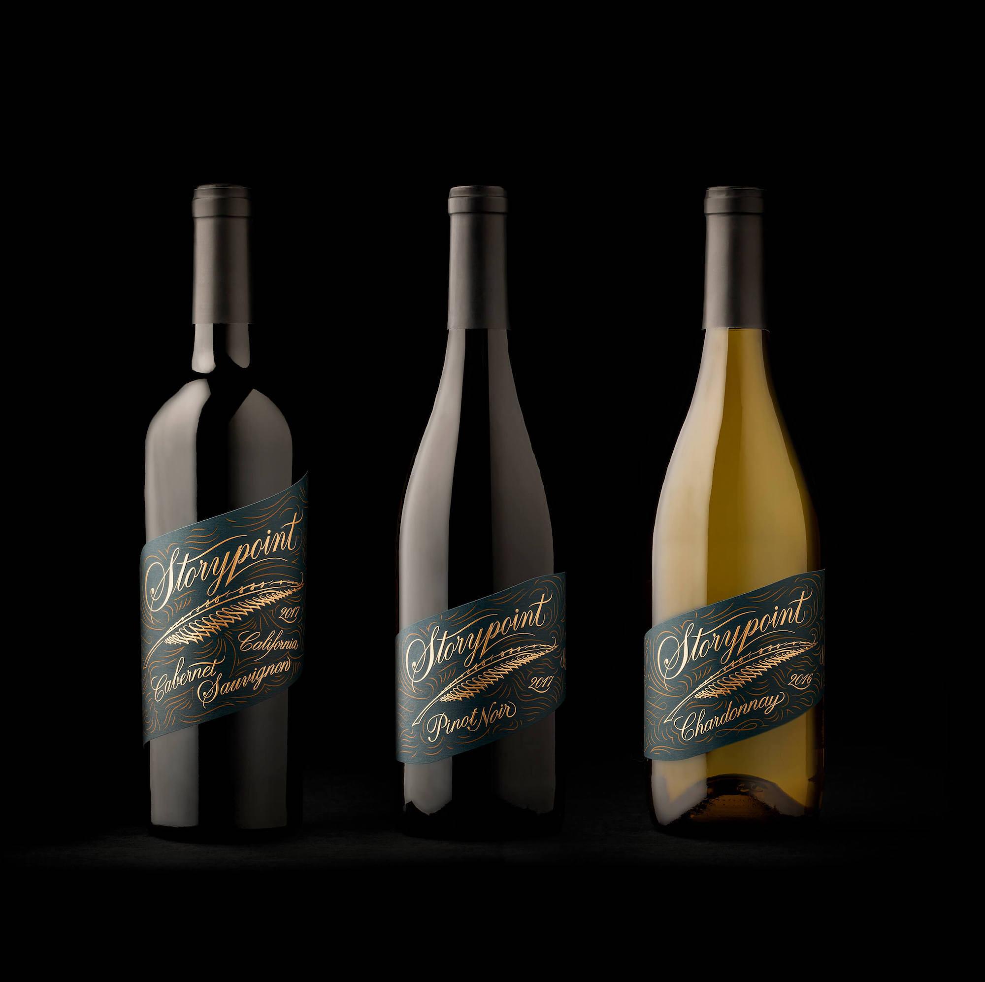
Some of the most captivating stories told happen over a few glasses of delicious wine. The redesign for Storypoint takes on an old-time approach to the way we tell stories. By crafting the design around a typeface that looks like someone scrawled it by candlelight and a gold-foiled quill pen, Storypoint wine marks a solid step forward for the wine brand. Although the design might not be rooted in a modern design system, the result has a classic, approachable feel.
During the course of any ordinary evening, it is the moment the bottle of wine is opened where the story begins. Storypoint Vineyards makes wine that serves as the catalyst for great stories you’ll tell for years to come. Our goal with this rebrand was to modernize the package while maintaining some consistency with the original label, in order to maintain brand recall. We took inspiration from the rich blue color and script font, enhancing both with custom illustrations, gold foil, and an emboss to establish a strong design system that could be extended across multiple SKUs. Paired with a new unique label shape, Storypoint has an iconic shelf presence.
Get unlimited access to latest industry news, 27,000+ articles and case studies.
Have an account? Sign in