Featured image for Pearlfisher Redesigns McDonald’s Packaging As Part Of New Global Strategy

Pearlfisher Redesigns McDonald’s Packaging As Part Of New Global Strategy

by Rudy Sanchez on 02/13/2021 | 3 Minute Read

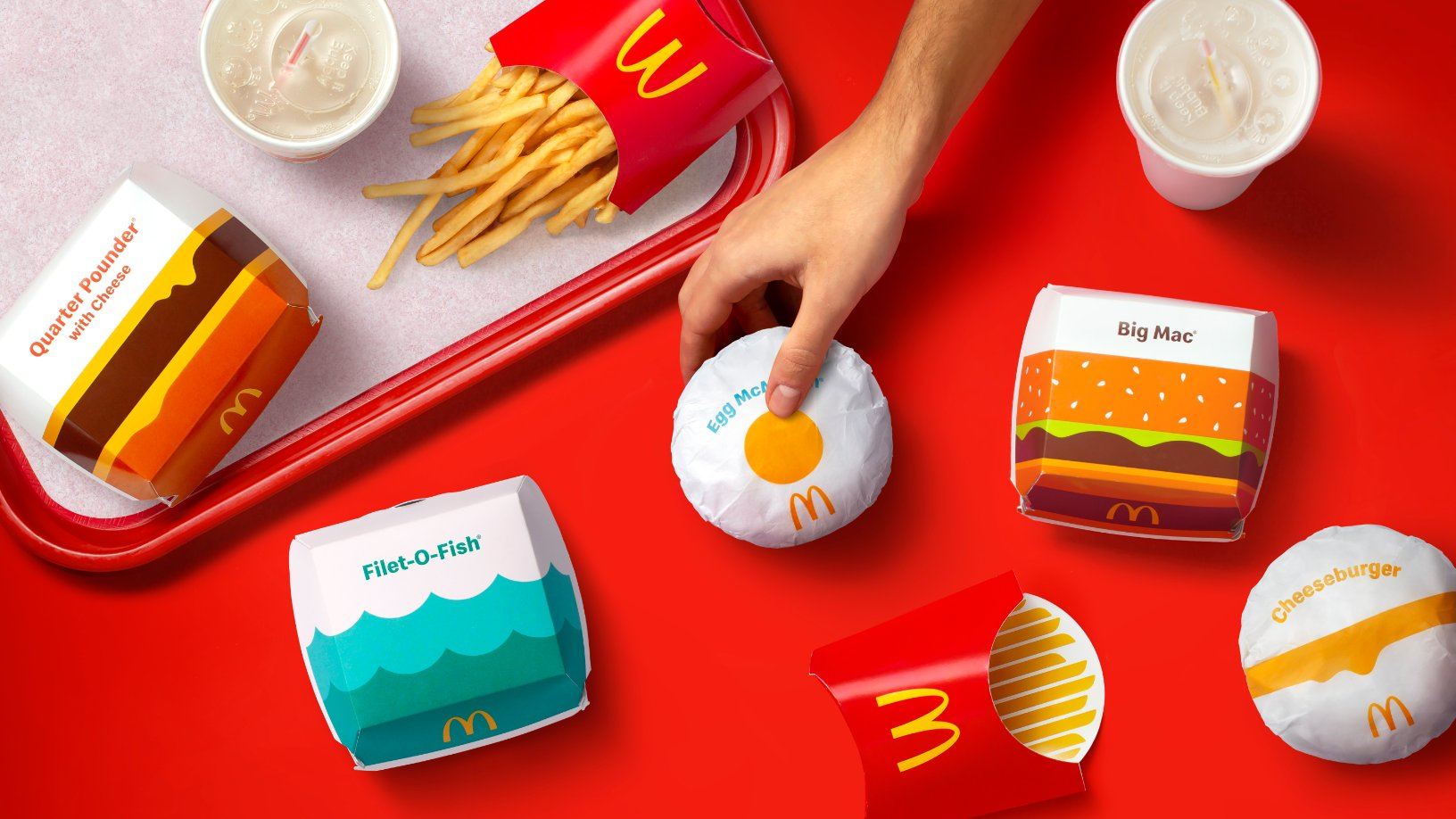
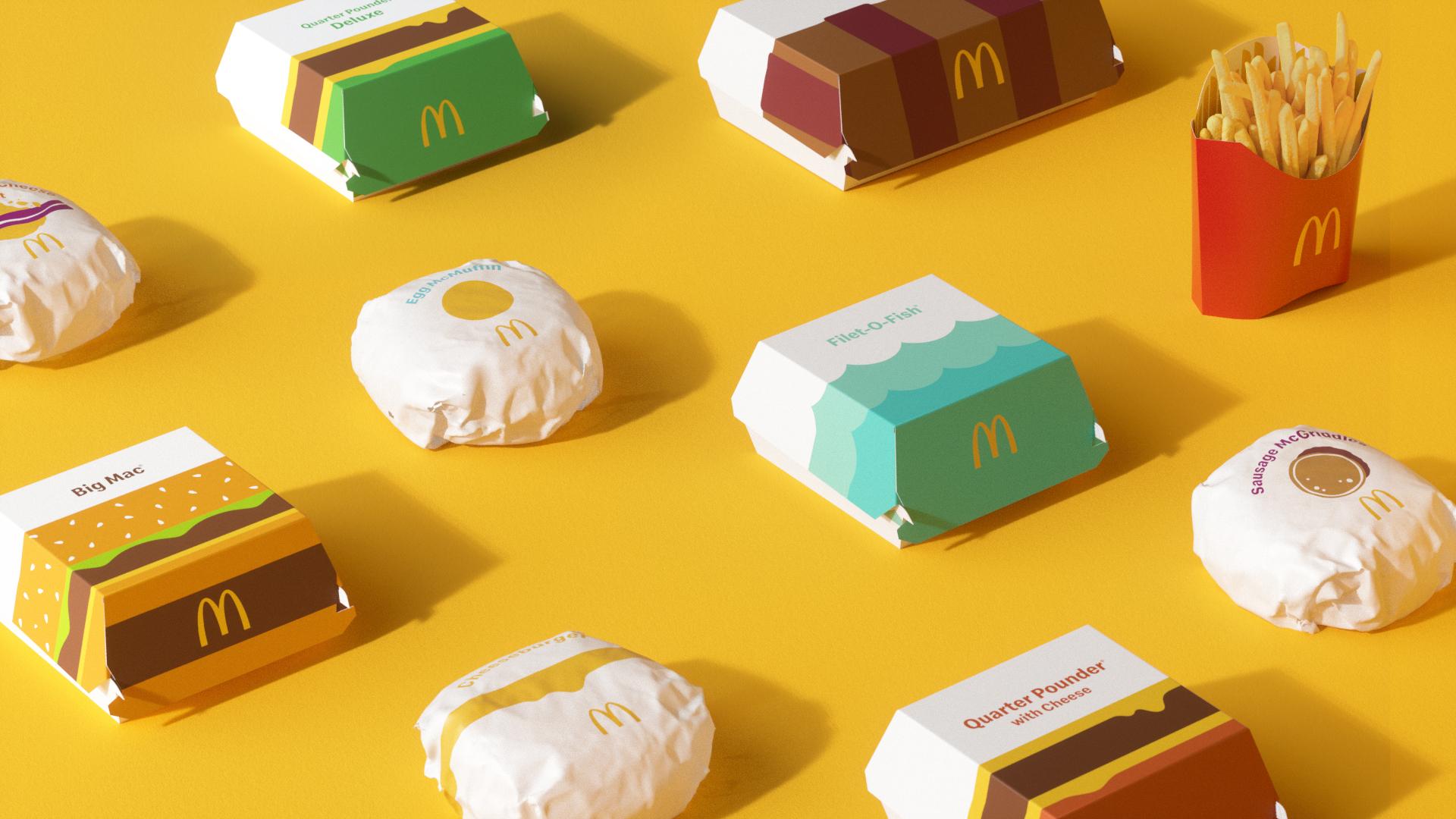
Fast-Food international giant McDonald’s quietly unveiled its new global packaging system at the tail end of 2020, marking the beginning of a strategic marketing and operations shift. 

Now, the full scope of that packaging refresh has finally seen the light of day, and none other than creative and branding agency Pearlfisher is behind the work. As part of an overhaul of the beloved arches’ multi-year redesign, they oversaw the implementation of a new graphics system, what they’re calling the “single visual framework for the brand’s portfolio of products.” 

Editorial photograph

In the initial announcement last November, McDonald’s International President, Ian Borden, said packaging represents over 60 million different touchpoints with consumers every day. The new visual system is clean, simplified, and made up of fun and bold graphics. Many changes have been necessitated in the short-term as the burger chain adjusts to the pandemic, though McDonald’s has signaled long-term changes in the way it operates, like alterations to store designs that cater to mobile and drive-thru orders.

Editorial photograph

The flat illustrations present throughout the design system make for a streamlined affair.

Editorial photograph

“Our task was finding out what was really special about each menu item to design a system that would make it easy for others to do the same,” said Matt Sia, creative director at Pearlfisher, in a press release. “There’s beauty in the simplicity of McDonald’s’ iconic menu items. We aimed to find the most special, recognizable, and iconic expression of each—celebrating them in a way that makes people smile. Bringing personality to life through simple illustration allows the packaging to be functionally unique, easy to identify, aesthetically minimal, and, most importantly, emotionally joyful. Everything in this system has a purpose and helps activate McDonald’s’ brand positioning to make delicious, feel-good moments easy for everyone.” 

Editorial photograph

The iconic menu items housed in the new boxes, sleeves, wrappers, and cups also feature on the outside for easy identification in-store. The classic red french fry sleeve is the least touched, though the inner pinstripes get replaced with thick yellow stripes. Egg McMuffin wrappers are especially whimsical, with a yellow yolk sitting in the middle of the all-white wrapper. Quarter Pounder and Big Mac boxes depict layered graphic representations of the signature burgers along with oozing cheese. Fillet-O-Fish containers take a different approach—instead of a fried fish patty, two-toned ocean waves adorn the outside. Typography is the same across the range and is clean and modern.

Editorial photograph

The new system will be rolled out globally as part of an effort to create a single and cohesive identity in every market McDonald’s operates in. Not only that, but the new packaging ensures that employees will be able to easily identify the content of the packaging so that operations may run efficiently, regardless of the country you’re ordering it in.

Editorial photograph

“We’re proud to debut this redesigned system,” said Barbara Yehling, senior director of global menu strategy at McDonald’s, in the same press release. “Pearlfisher helped to ensure that this redesign modernizes our brand, highlights the specialness of our menu, and delivers on our commitment to quality.”

Editorial photograph