Outpost Cannabis Co. Gets A Slick And Crunchy Granola Design
By
Published
Filed under

By
Published
Filed under
Have you ever wanted to get high but also feel super granola? If so, Outpost cannabis has got you. Looking like a line of sophisticated hiking snacks, this brand smokes out the rest of the competition with a slick logomark. Plus, the parchment look and feel of the packaging gives Outpost a refined, vintage mail look.
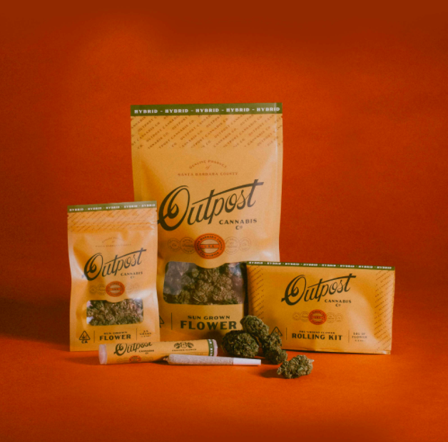
Where Outpost Cannabis Co. gets is appeal is simple. Think an ice-cold Coors on the back of a dinged-up pickup truck. This is the energy Outpost aims to achieve. After extensive market research, they successfully found a niche in the crowded California cannabis industry. Unlike their counterparts, Outpost brings us affordable, no-nonsense cannabis. By pairing a casual, straightforward ethos with a sophisticated and iconic package style, it stands out (in a good way).
Get unlimited access to latest industry news, 27,000+ articles and case studies.
Have an account? Sign in