Theo Chocolate’s Holiday Redesign Looks Like Christmas and Tastes Like Success
By
Published
Filed under
By
Published
Filed under
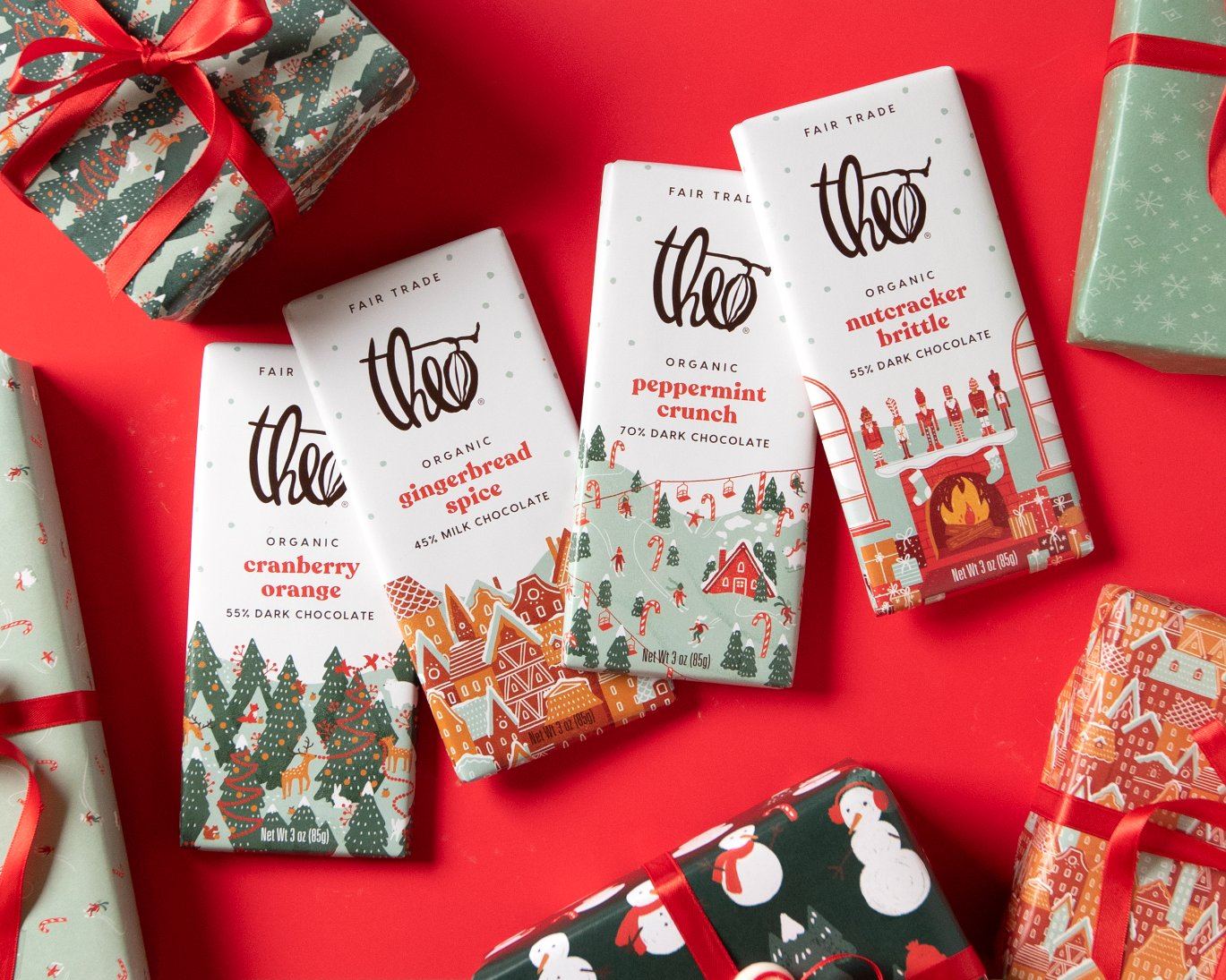
It’s that time of year again.
The air turns crisp, holiday hits dominate the airwaves, ugly sweaters are fleetingly in fashion, and retailers deck the aisles with limited-edition, holiday packaging. Even grocery shopping takes on a slightly more emotional air as consumers absorb the festive atmosphere and scour the shops for gift-worthy stocking stuffers.
“People who are shopping for holiday products are in a different mindset and have a different reason for buying than an everyday chocolate buyer; they’re in a seasonal mood and want to celebrate. It’s an opportunity for brands to amp up the gifting potential and channel more cheer—and, ultimately, to bring new buyers into the brand,” said Monique Heineman, brand manager at Theo Chocolate, the first organic, fair-trade, bean-to-bar chocolate producer in the United States.
Get unlimited access to latest industry news, 27,000+ articles and case studies.
Have an account? Sign in


