Velveeta Touts Its Cheesy Opulence In Brand Refresh From JKR
By
Published
Filed under
By
Published
Filed under
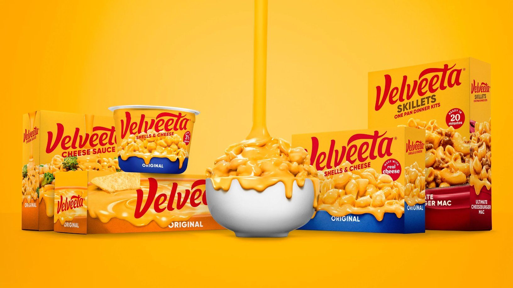
Velveeta is that cheesy, gooey saucy goodness that makes just about anything it tops even better, a savory indulgence that seems out of time when so many packaged foods strive to be healthier options. The Kraft-Heinz brand is undertaking a repositioning; instead of touting its convenience as a processed and packaged meal or cheese, Velveeta wants to own its decadence with a brand refresh that highlights its ability to be a comforting and pleasurable food.

Enlisting the talented folks at JKR, Velveeta’s refresh is the first major update to the brand in two decades. The core elements of the brand remain, especially the signature yellow, and the wordmark remains red. But the logo is now stripped of the superfluous, removing the “liquid gold” tagline, the broken circular frame, and the underline along the bottom of the brand name. Void of the oh-so-aughts gradients and shadows, the logo is a flatter, more minimal affair that retains panache and flair through updated typography that is more fluid. The Velveeta wordmark flows like liquid cheese with its round shapes and speaks to the indulgent pleasure of pouring cheese sauce all over your food.
Get unlimited access to latest industry news, 27,000+ articles and case studies.
Have an account? Sign in