JKR Refreshes Burger King, And It’s So Juicy You’ll Need Some Napkins

Published

Filed under

,

Though the Burger Wars are now a memory, competition in the Quick Service Market (QSR) remains fierce with more players in the market with massive shifts in technology, consumer preferences, and, of course, a tumultuous year that upended many aspects of the industry. Burger King hasn’t given the crown a deep polish in twenty years, and the brand felt it was due for a significant refresh to appeal and connect to a landscape much different than the one at the turn of the millennium.

Editorial photograph

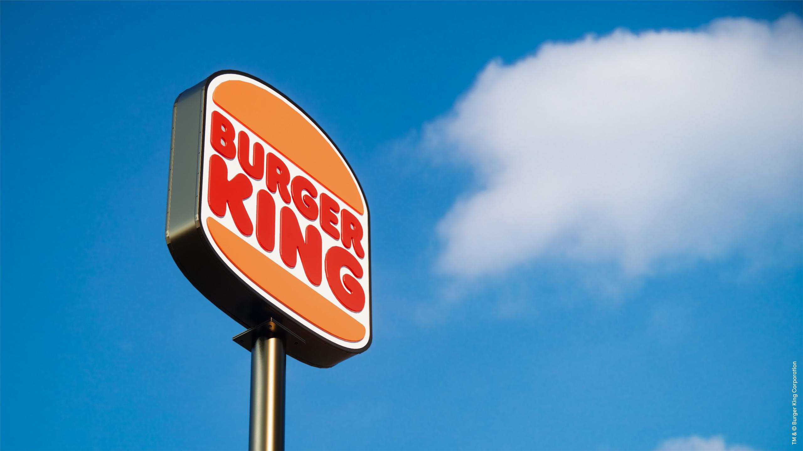
Burger King wants to bring focus on its competitive advantages, like all-natural ingredients and flame-broiled goodness. The king needed guests to feel good about its food, and in 2021 that includes quality, in-person and mobile experiences, as well as its environmental impact. Burger King, not playing around, enlisted the services of agency Jones Knowles Ritchie (JKR), who’ve provided the Midas Touch recently to other QSR brands such as Dunkin, Popeyes, and Baskin Robbins.

“Every design element was intentionally reimagined to better reflect the new Burger King food journey,” says Rapha Abreu, vice president and global head of design at Restaurant Brands International, the parent company of Burger King. “The design principles capture the unique characteristics of the Burger King brand—mouthwatering, big, and bold, playfully irreverent, and proudly true.” 

Editorial photograph

The new logo ditches the planet-like orb, and it clearly finds inspiration in previous iterations, a callout to the longevity and legacy of the beloved brand. Rather than expressing kinetic energy, the new Burger King exudes heft and strength. It’s a meaty manifestation of burger prepotency, with a touch of retro flair.

Editorial photograph

“An ‘aha’ moment was when we landed on the idea of making the Burger King brand literally as crave-able as the food,” said Lisa Smith, executive creative director at JKR. “That meant making every single element inspired by the food—from the Flame typeface which evokes the natural, organic shapes of ingredients and looks so mouthwateringly delicious, to the colors, which are inspired by the Whopper and BK’s trademark flame-grilling method of cooking the burgers.”

Editorial photograph

Bright illustrations of toppings dominate the new wrappers, a preview of the deliciousness that awaits. You can find the fresh, all-natural ingredients on dine-in trays and the new uniforms as well. The typography is just as succulent, as sumptuous curves and shapes project the tastiness that brings patrons to Burger King. Large swaths of color dominate the new store designs, and the round shapes found in the illustrations and type get complemented by straight lines in the decor and architecture, which is less focused on in-store dining and emphasizes take-out, drive-thru, and mobile ordering.

Editorial photograph

The focus on ingredients is perhaps also reflective of the many ways that food gets to customers today. Integrating and embracing mobile and delivery as a core way Burger King interacts with its customers, not an after-thought, a sign that the brand is investing in a future of customers primarily ordering food via an app and eating it somewhere else.

According to Abreu, the new visual identity will live alongside the old one for some time while the new look gets rolled out across physical and digital spaces.

Editorial photograph

Editorial photograph

This placeholder is removed when the ad slot is configured.

This placeholder is removed when the ad slot is configured.

This placeholder is removed when the ad slot is configured.

This placeholder is removed when the ad slot is configured.

This placeholder is removed when the ad slot is configured.

This placeholder is removed when the ad slot is configured.