NEFT Vodka Looks Good, Tastes Good—and Does Good

Published

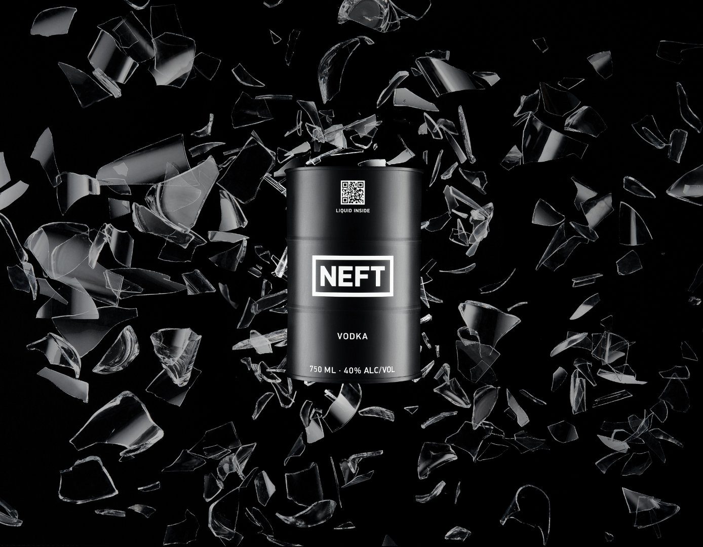
Vodka isn’t known to be a sipping drink. Typically, it’s part of a cocktail or—depending on the night—endured from a shot glass. People are happy to sit back and enjoy the tasting notes of sweet honey and cozy vanilla in their whiskey, or the refreshing spices of their gin, but vodka? Not so much.

Jeff Mahony hopes to change that.

Jeff is the director and CEO of NEFT Vodka, an ultra-premium spirit with roots in Russia and ingredients sourced from the Austrian Alps. NEFT, he said, is not the type of vodka you mix with sugary cranberry juice. Nor is it something you attempt to shoot while hiding the wince on your face. It’s smooth, clean, and perfectly pleasant. It’s good all on its own. That by itself sets NEFT Vodka apart, but the packaging is what gets it noticed in the first place.

Editorial photograph

NEFT Vodka came about in 2012. Ekaterina Kuzmina wanted to create a vodka that paid homage to her family’s roots in the Siberian oil workforce. Russia wasn’t an ideal place to produce the kind of spirit she was going for, though. To have the best distillation process that would result in the cleanest, purest product possible, Ekaterina went to an award-winning distillery in Austria for the solution. There they have an aquifer that provides water that gets filtered through slate and granite—and in that process, it picks up extra oxygen and minerals that create a softer water.

That, combined with non-GMO grains and a triple copper pot distillation process, provides the rich, smooth profile that NEFT is associated with. It’s not got the bite you experience with other vodkas, and it doesn’t require additives like sugars or flavoring to taste better. So when Jeff got to taste NEFT Vodka for himself, he knew it was something special. 

Editorial photograph

“I immediately thought to myself, ‘this is the answer to the question I’ve had for 35 years,’” Jeff said. “When is there going to be a sipping vodka that I can enjoy, like all the other categories of spirits? NEFT comes out clean, it comes out refined, and it comes out perfect for sipping.”

While we can thank Austrian water for the taste, those Russian roots are still evident. The brand name, NEFT, means “oil” in Russian, and the packaging is a unique tin barrel rather than a glass bottle. And although the packaging certainly catches your attention, it’s not merely a gimmick. The mini vodka barrels are specially made for NEFT and go through rigorous testing (and constant improvements) to ensure they’re unbreakable and that the varnish inside the barrel preserves the product without affecting its flavor.

Editorial photograph

“It’s also important that the packaging is recyclable,” Jeff added. Although their packaging costs more to produce than a typical glass bottle, his goal is to think of the long game. “Tin and aluminum are very easily recyclable, and the varnish itself can get easily cleaned from inside, so you have a wonderful form factor with eco-conscious benefits.”

Being environmentally aware is vital to the brand, and some of their factories are quickly on their way to using 100% renewable energy. Most important, though, is that NEFT is a “for cause” company. Yes, they sell a high-end vodka that tastes great and has one-of-a-kind packaging, but Jeff emphasized that social good has been an integral part of the brand from the beginning. NEFT gives to a variety of causes and charities, like Project Angel Food or people financially affected by the pandemic. They even have a board mandate to deliver a portion of revenue from each sale into charity immediately.

Editorial photograph

This ethos aligns with the product NEFT produces, too. The founder didn’t just slap “ultra-premium” on the packaging—she went all the way to find Austrian spring water to go into it. For brands to do social good in a way that isn’t performative, Jeff added, it must be built into the way they operate. It has to be real, and it must go deeper than the surface. NEFT’s Pride packaging is an excellent example where they put thought into the actions behind the packaging rather than merely put a rainbow on the barrel. The design came from a Los Angeles-based artist Paul Robinson, and a portion of sales went to a charity of choice. They even designed specialty cocktails at West Hollywood bars to go to the cause.

“We want to make an impact,” Jeff said. “And as we grow, hopefully, we can have a bigger impact. Most of the folks who are in this company at the executive management level have already made their money, as it were. They’ve already experienced success. Now they’re here to create something that gives back to the community.”

Editorial photograph

This placeholder is removed when the ad slot is configured.

This placeholder is removed when the ad slot is configured.

This placeholder is removed when the ad slot is configured.

This placeholder is removed when the ad slot is configured.

This placeholder is removed when the ad slot is configured.

This placeholder is removed when the ad slot is configured.