Featured image for Elmwood NY Refreshes Tecate For A Broader, National Appeal

Elmwood NY Refreshes Tecate For A Broader, National Appeal

by Rudy Sanchez on 09/21/2020 | 3 Minute Read

Editorial photograph

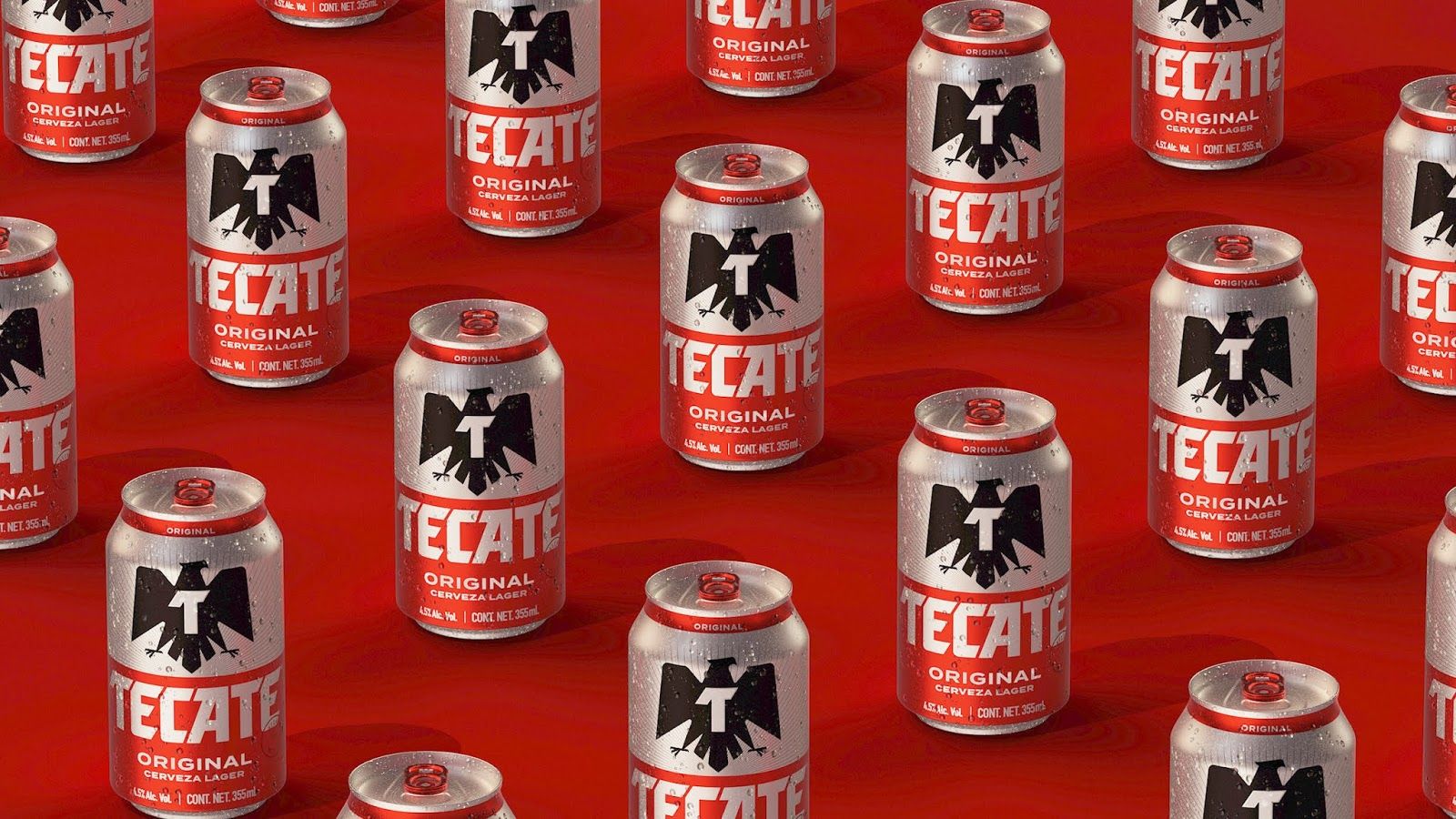
Tecate Beer was first brewed in 1944 and named after the Baja California city where it originated. Since then, the beer has enjoyed massive success throughout Northern Mexico, but, as almost all of the larger brewers have done this past year, they recently decided to undergo a visual refresh that would give the brand more appeal across the country, including the hip and cosmopolitan capital Mexico City. 

Looking to modernize the brand, Tecate once again enlisted the services of agency Elmwood NY to give the beer a visual identity that would broaden its consumer base nationally without alienating longtime loyal fans (they last did a refresh back in 2015).

Editorial photograph

All projects require some background research, of course, but the folks at Elmwood New York dove headfirst, fully immersing themselves into Mexican culture and markets, approaching the storied brand with respect and diligence.

Editorial photograph

“With a brand as beloved as Tecate, we knew that a boots-on-the-ground immersion across Mexico’s many regions would be necessary to inform a meaningful design. From this process, we understood that the brand is deeply entwined in the country’s cultural fabric. Yes, it’s a great beer, but it’s more than that; it’s an authentic lifestyle icon ingrained in Mexican sports, music, and entertainment. We needed to shift the narrative beyond product—to an attitude encapsulating Tecate’s unapologetic boldness and modern masculinity,” says Meg Beckum, Executive Creative Director at Elmwood NY.

Editorial photograph

Elmwood kept the core visual components of the storied Mexican brand, including the black eagle logo and the sharp, angular typeface, elements that have been across the country for decades at sports and entertainment venues and events. They also retained colors long associated with the brand, such as silver, red, and blue. Elmwood visually declutters the label, and the silver background now features a radiating pattern instead of the logo’s eagle. Additionally, the outer packaging is a cohesive extension of the beer labels, and secondary typography compliments the bold type for the brand.

Editorial photograph

Elmwood NY also made sure to tie national identity as an integral component of Tecate’s branding. Tecate has long had a presence in Mexican sports such as boxing and soccer, as well as music. Though Tecate’s goal was to broaden its appeal to a more diverse and cosmopolitan consumer base, the brand connects itself to everyone via the commonalities of the Mexican identity.

Ultimately, Elmwood NY’s work propels Tecate from a beloved beer brand to a hip, modern lifestyle brand, revolving around a continuously evolving national identity.

Editorial photograph