Type really can help tell the story of a brand in the way it curves bends. The brand design for Kaolin features a gorgeous, weaving, and maleable font that speaks to all the possibilities clay has before it’s fired. The type logo translates beautifully across Kaolin’s color pallet and brand assets. With Kaolin, the possible ways you can shape and design your home seem endless.
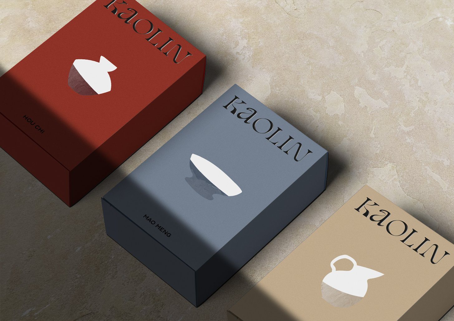
Creation of the visual identity of Kaolin, workshop for the artisanal manufacture of pottery and ceramics where its artisans and objects respect the traditions.
Kaolins are clays allowing the design of many potteries. These clays are therefore the raw material and embodies “pre-conception”. This Kaolin name allows the workshop to establish itself as the place of craftsmanship par excellence. Our creative work focused on a typographic logotype. Between roundness and malleability, the typography embodies the future moving object which is formed and deformed thanks to the turn and the hands of the potter. The graphic universe unfolds around a delicate palette of colors bringing back to earth, ceramic and earthenware. The know-how is reinforced by illustrations of a “naive” style of objects contrasting with the relief of the textures.


