Kona Coffee Purveyors is a Stunning Display of Reexamining the Roots of a Company
By
Published
Filed under

By
Published
Filed under
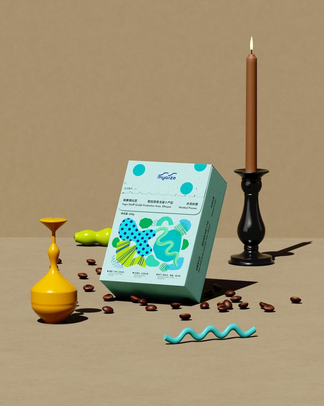
The redesign for Kona Coffee Purveyors is a stunning display of what it means to reexamine the roots of a company, and refine them for a modern time. The coffee labels themselves are a beautiful beige with foil embellishments, that are amplified by the shapes and vibrant colors of the rest of the package. These elements work in harmony to make Kona Coffee look sophisticated, yet approachable.
We recently re-designed the Kona Coffee Purveyors brand and packaging — a process that took us back to our roots and challenged us to express our commitment to excellence across every facet of the business. We are so proud to be sending these bags out into the world, and look forward to hearing your thoughts about the new design.
Here’s a little bit about what drove the design of the new brand and packaging.
Get unlimited access to latest industry news, 27,000+ articles and case studies.
Have an account? Sign in