Our 5 Favorite Winners from The Marking Awards 2019

Published

“Gaining New Momentum from Open Innovation.” 

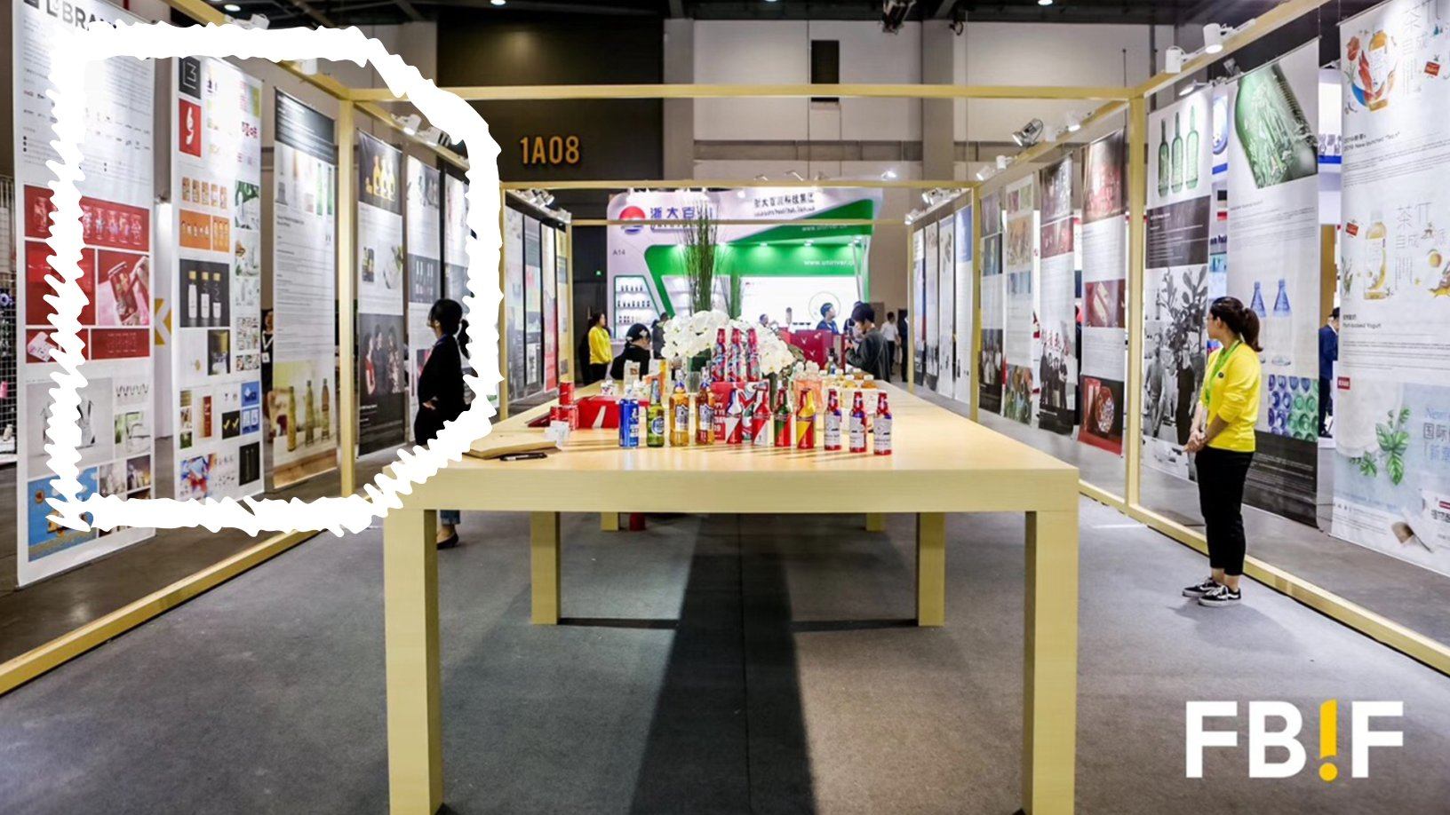
Food & Beverage Innovation Forum 2019 (FBIF 2019, for short) took a closer look at the progress and transformation of the food industry, and their accompanying packaging design competition called the Marking Awards did just the same.

Presented at FBIF 2019 in Hangzhou, China, the contest aims to speed up the industry’s packaging innovation and improve aesthetic standards, recognizing form and function. Judges from respected agencies and companies (including PepsiCo and Nestle) evaluated each entry on elements like originality, communication, and foresight, and each winner truly looks unlike any other in the competition. Convenient on-the-go tea packaging, conversation-starting gin bottles, humorous chip packs—if it’s packaging related to food or drink, it has a chance to stand out in the awards.

The Marking Awards 2019 received over 500 submissions from 200 brands and agencies globally, and 37 projects were recognized. Here are our five favorite winners from the awards this year.


20190327102220442044.jpg

Grand Marking: Fish Club Wine

Designed by: Backbone Branding

Fish Club Wine makes pairing a vino with seafood even easier, and it stood out to the judges for its simple yet clever approach. The papers surrounding the bottles are mirror metallic (requiring a special technique for printing), and they are all hand-wrapped onto the bottle itself to show just the right amount of the wine inside. The metallic wrapping instantly catches the eye, but it also serves the practical purpose of getting consumers to think about what they’d like to pair with their drink.

“The branding and concept were designed for exceptional fish lovers, who appreciate the real taste of wine and true hospitality in an inspiring atmosphere. The core design element is fish scale, a simple, yet bold thought as this is a common element in all fish regardless of their type, size, and shape,” Backbone Branding said about the project on their site.

20190327155515221522.jpg

Marking Visual: Pavomea Chickpea Crisp

Designed by: Jansword Design

Leonardo da Vinci continues to influence the world, even through packaging design. His portrait “The Lady with the Ermine (1489-1490)” inspired Jansword Design to create four female figures for the separate flavors of these snacks. When consumers open the packaging, the eye part of the illustrated figures changes, indicative of the social mask people wear in their daily lives—a standout element to the jury. Judges said, “We love the DaVinci influence, the mystery of the opening, and the metaphor of the social mask unveiled.”

20190328190134903490.jpg

Best Design of Business Value: Superfly

Designed by: B&B studio

Beautifully unbranded. The no logo approach here caught the attention of the judges as a courageous approach done oh-so-right. Without a brand name cluttering the packaging, the bottle doubles as a bright and botanical piece of art. Additionally, without a logo, brand name, or description, it invites the consumer to pick it up and learn more and, of course, try it.

“We weren’t really trying to ‘clearly communicate’ to consumers, we were trying to attract their attention, create intrigue, and drive desirability the unbranded bottle is all part of that,” Shaun Bowen, Joint Founder and Creative Partner at B&B studio, told Dieline in a project feature. “Of course, we also wanted to express the taste of the drink and its botanical ingredients, which the illustrations do perfectly. We banked on the shape of the bottle being enough to place the design comfortably within the Firefly range as well as help trigger consumer recognition over the longer term.”

20190327114770137013.jpg

Marking Concept: Quantifiable Oil Bottle

Designed by: GUANGZHOU SINLIEN(Z.T.) CO., LTD & Shanghai Fanso Industrial Design Co., LTD

“Born from a worthy societal insight, this concept stands out in its desire to add utility and make a difference,” the jury for the Marking Awards 2019 explained. “There are clear environmental advantages to precise measuring, and nutrition and health benefits that make it very interesting.”

This concept eliminates the need for a measuring cup, putting it right in the cap of a bottle and making life more convenient for the consumer. Although the path to getting this onto the market still remains up in the air, the design team said it would be feasible to produce.

20190327114971507150.jpg

1st Prize Student Group: Leaf Vein Tea Bag

Designed by: Liu Shanshan, Huaqiao University

It’s easy to forget the leaves for a cup of tea were once living out in the wild, and this project helps to remind us of the beverage’s origin in a lovely way. The tea bag looks like a perfectly dried leaf you might find on a November walk through a park with delicate veins splayed out from the center. It doesn’t change the tea brewing process in any way but creates a nature-focused experience for the consumer.

This placeholder is removed when the ad slot is configured.

This placeholder is removed when the ad slot is configured.

This placeholder is removed when the ad slot is configured.

This placeholder is removed when the ad slot is configured.

This placeholder is removed when the ad slot is configured.

This placeholder is removed when the ad slot is configured.