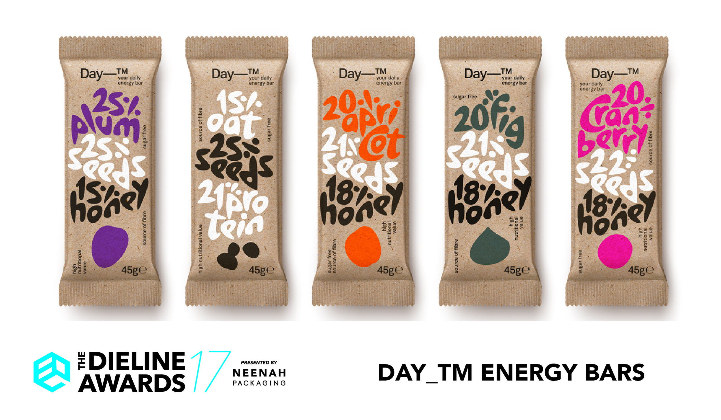


To name this daily snack we simply trademarked the time-span of its use: ‘Day-TM’ registers as a hip and easy to remember formula. Energy bars look like quasi anarchist clusters of materials (dried fruit, nuts, cereals) or abstract mosaics and this served as our main graphic inspiration. We devised a hand drawn typeface that replicates in synthesis those clusters and reveals their content in percentages (fruits, seeds, protein, honey). Typography animates packaging with shapes which are the same for letters and objects. The packaging surface holds them together exactly like honey binds the bar ingredients. Energy must sure play a role inside and out.


Designed By: mousegraphics
Client: V. Sdoukos Sa
Location: Athens, Greece


