Featured image for Observing Human Behavior Led to YAN Juice’s Unique Bottle Shape

Observing Human Behavior Led to YAN Juice’s Unique Bottle Shape

by Theresa Christine Johnson on 11/22/2017 | 7 Minute Read

Editorial photograph

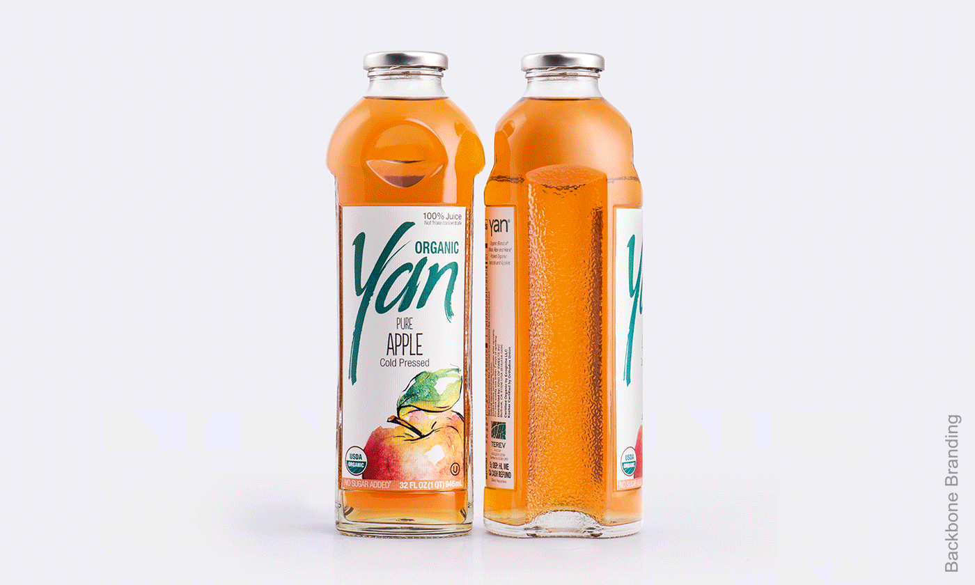
There’s nothing quite like a big bite right into a fresh, juicy apple. Biting into fruit is exactly the inspiration Backbone Branding turned to when designing YAN, a line of pure, delicious juices. We spoke with Backbone Branding to find out the challenges of creating a new glass bottle, observing human behavior to inform design, and more.

Editorial photograph

Walk us through the design process that you went through for this project.

Backbone Branding: The phenomenon of bitten apple according to Backbone Branding

Back in 2005, Stepan Azaryan, our Creative Director, in cooperation with Printinfo Publishing House,  undertook to develop a new brand of natural juices.

Taking the challenge, we started to analyze people’s fruit-eating habits. Mainly, they would either slice or bite the fruits. It was interesting to see that the most attractive fruits are bitten impatiently, and if it tasted good, people would take a second bite. The shape and the pattern of a double-bitten apple led us to experiment and develop different models of bottles. In this experiment we discovered that the bitten and the wholesome parts of apples complement each other just like Yin and Yang. This complementary pattern gave birth to an idea for a functional solution and distinctive identity. The unique arrangement of bottles would save a significant amount of space in the box, container and on the shelves.

An additional function of the new shape made juice transportation safer in comparison with the regular cylindrical bottles that are more fragile.

To emphasize the premium quality and the eco-consciousness of the product, we chose recyclable glass as a perfect material for storing it.

Editorial photographEditorial photographEditorial photographEditorial photograph

User Experience

Having identified the main philosophy of the bottle, we were still observing how people use bottles at home or in the office.

We saw how they hold the bottles while putting them in a refrigerator and taking them out. People would usually take them from the bottleneck or its cover. So we came up with a furrow-shape solution for the upper part that made it comfortable for the fingers to hold the bottle.

Another additional feature was an anti-slip surface on both sides of the bottle which made it easy for people to pour from slippery bottles.

The now-classic Yan bottle has been on the shelves for more than a decade, never losing its demand. The shape has become so popular that sometimes people would apply “the comfortable bottle” as a synonym for Yan.

Last year the manufacturer decided to refresh the label to stay relevant with current perceptions. For this purpose, a new label was designed, with an application of a stylized calligraphic inscription “Yan”, which resembled a thin grass reed, reminding of nature. The manufacturer decided to print the label on recycled paper so the brand message would be “Organic in Everything”.

Editorial photograph

What was one of the biggest goals you set out to achieve with Yan packaging and how did you accomplish it?

Backbone Branding: Considering the Armenian family-centered society, we needed to create an emotional attachment to the product that every family would connect to.

We wanted people to treat the juice Yan as their favorite family guest, since most of Armenian family names end with “-yan”.

Another great solution that supported the family concept, was the functional layout of the bottle. The previously mentioned complementary sections of the bottles became a good visual symbol of a hugging couple. The bottles placed next to each other would look like a loving family, especially as the juice comes both in small and big bottles, representing two generations. Our goal was to inspire hosting families to place juice on the tables and symbolize that the juice family is also happy to be on the table.

Editorial photographEditorial photographEditorial photographEditorial photographEditorial photograph

Creating a completely new bottle shape certainly disrupts expectations. How did you execute this idea and make it a reality?

Backbone Branding: This was not just a visual solution but a structural one. The idea was well-received by the manufacturer, especially when they saw the connection between the concept and the physique of the bottle. Technical challenges were the hardest part. But once solved, they added value to the product, making its way to the Premium category.

Editorial photographEditorial photographEditorial photograph

What challenges did the unique bottle shape pose in this project?

Backbone Branding: Glass bottles aren’t easy to develop. Unlike the average cylindrical bottles with the perfect symmetry, these ones faced many problems in the manufacturing process. We calculated the perfect proportions, made it geometrically correct, and yet different curves on the bottle came slightly uneven.

The heat of autoclave sterilization process would break the thinner parts of the glass. So the solution was to reduce the temperature in autoclave. It resulted in shortening the shelf life of the product but kept it fresher. The challenge turned into an advantage which made the juice healthier and tastier, proper of a premium brand.

If you could pick one aspect of the finished design that you like the most or feel especially proud of, what would it be and why?

Backbone Branding: The new shape is probably what we are most proud of. We combined convenience and the emotional value. They both solve the client’s problems, even some that they didn’t pose in the first place.

Editorial photographEditorial photograph

Share one lesson that you learned while developing the finished product.

Backbone Branding: We learned that thorough observation of human behavior and experimenting with shapes can lead people to hidden solutions of improving buying experience. Our conviction to bring fundamental design solutions was expressed in asking deep and difficult questions, that would consider human needs and aspirations, while working to marry them with functionality. People don’t need just something beautiful but they should enjoy beautiful solution along with fundamental, descriptive, convenient solution. We came up with this bottle shape which solved a number of problems. We then used this fundamental discovery approach in all our further projects, solving as many problems as possible through functional and emotional packaging.

It’s challenging to dig out and discover solutions that it will satisfy the client, the people and ourselves.

Editorial photograph