Featured image for Danish Selection jams

Danish Selection jams

by Elizabeth Freeman on 04/27/2016 | 2 Minute Read

Editorial photograph

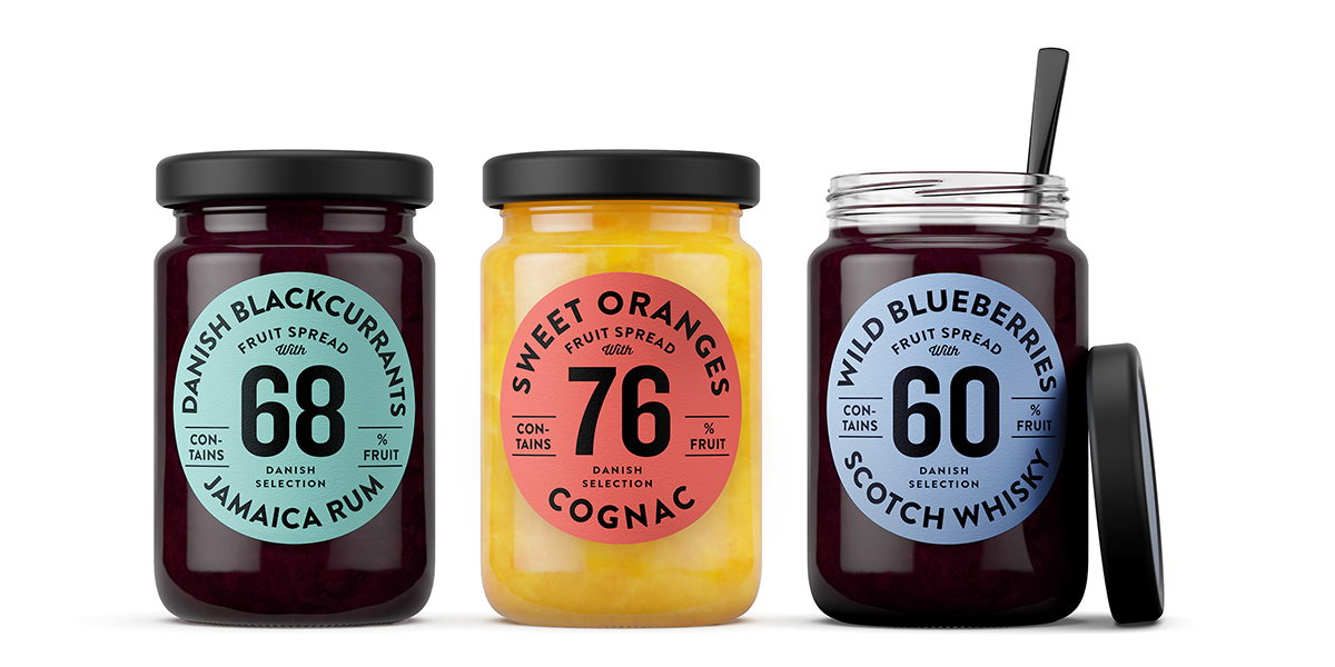
Orkla Foods Danmark came to Kontrapunkt with a new product range – fruit spreads with alcohol – wanting a design concept to go with it. Several challenges made this assignment interesting. First of all, the product's primary target group is men. Insights showed that men want a no-nonsense design with clear communication. Secondly, the product’s important qualities obviously needed to be communicated up-front: it has more percentage fruit and berries than any of the competitors. And it combines finely chosen berries and fruits with distinct types of alcohol in interesting combinations. In short, this is a premium product. 

Editorial photographEditorial photographEditorial photograph

Lastly, the product needed to be significantly different visually from traditional preserves. The client asked for colors that stood out from the rest, but also linked to the taste of the products. Colors like clear red and white are dominant on the shelves. We, therefore, needed to do things differently. Our solution was to design around label concept and give it distinct colors – such as turquoise, tangerine, violet – to make the product stand out from the competitors on shape and color. We used the high berry and fruit percentages as a focal point on the labels and bumped up both the size of the berry names and the typeface for the alcohol descriptions. This made for a distinct typographic design with a clear reference to classic alcohol labels. To enhance the sense of premium quality we chose to produce the labels in a rough, uncoated paper stock with a mat finish. Again, making it stand out from the crowd. The new product range is launched throughout Europe this Spring.

Editorial photograph

Designed by Kontrapunkt

Country: Denmark