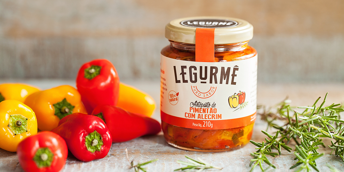

Just looking at Legurmê might make you feel a little hungry with delicious flavors like bittersweet eggplant and peppers with rosemary. IndustriaHED created the branding and packaging for Legurmê, resulting in a design that looks just as delicious as the varieties of antipasti the brand offers.
“The name Legurmê is a mix of words, ‘Legumes’ Portuguese word for Vegetables and ‘Gourmet,’ a cultural ideal associated with the culinary arts, word with the letter ‘t’ mute and ‘Puro Sabor’ that means pure taste or pure flavour. The modern craft brand targets young consumers with busy routines that seek high quality and convenient products. The colors differentiate the flavours of each antipasti, forming a collection of harmonious labels.”


