Übernuts

Published

Filed under

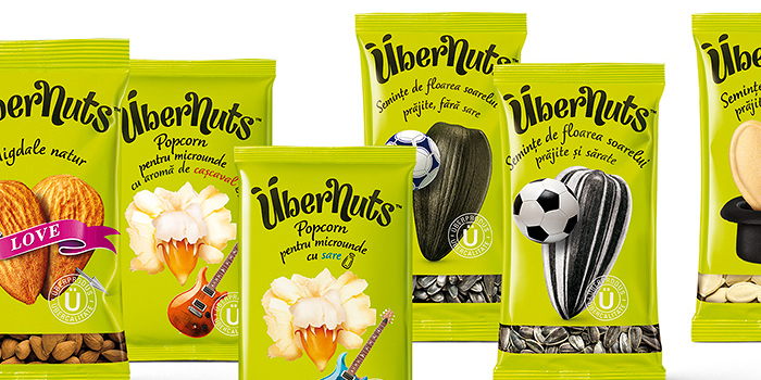
Übernuts naming, identity and packaging design by Brandient.


“A leading player on the pasta & snacks market in Romania decided to enter the packaged nuts & seeds category and needed a new brand for that purpose. The shelf is crowded and lacking differentiation, and packaging is predominantly playing at a functional level—therefore a strategy was devised to create a brand full of verve, with strong personality, cool attitude and good-natured humour, sustained by a bold name and visual manifestation.”

“The name Übernuts is using the German ‘über’—which permeated both English and Romanian vernacular as a cool word for “over, super”—to position the brand as a self proclaimed quality standout, but in a light hearted way. The multiple meanings of ‘nuts’ add to the mojo of the brand, aimed primarily at the young demographic.”

“The unconventional name prompted a logo designed with a custom hand-drawn typography—at the same time naive and eccentric—which inspired a temperamental visual platform.

The package design is poking ‘Pop Culture’ fun at a celebrity-obsessed world, where even the smallest grain in the crowd would dream to become a celebrity, be that a rock musician, a football player, an illusionist, etc.”

“The vivid neon color is a strong brand property, clearly standing out on the shelf, triggering curiosity and trial and consequently building brand awareness with less effort.”


This placeholder is removed when the ad slot is configured.

This placeholder is removed when the ad slot is configured.

This placeholder is removed when the ad slot is configured.

This placeholder is removed when the ad slot is configured.

This placeholder is removed when the ad slot is configured.

This placeholder is removed when the ad slot is configured.