Black Creek Gets a Sharp New Packaging System From Chase
By
Published
Filed under
By
Published
Filed under
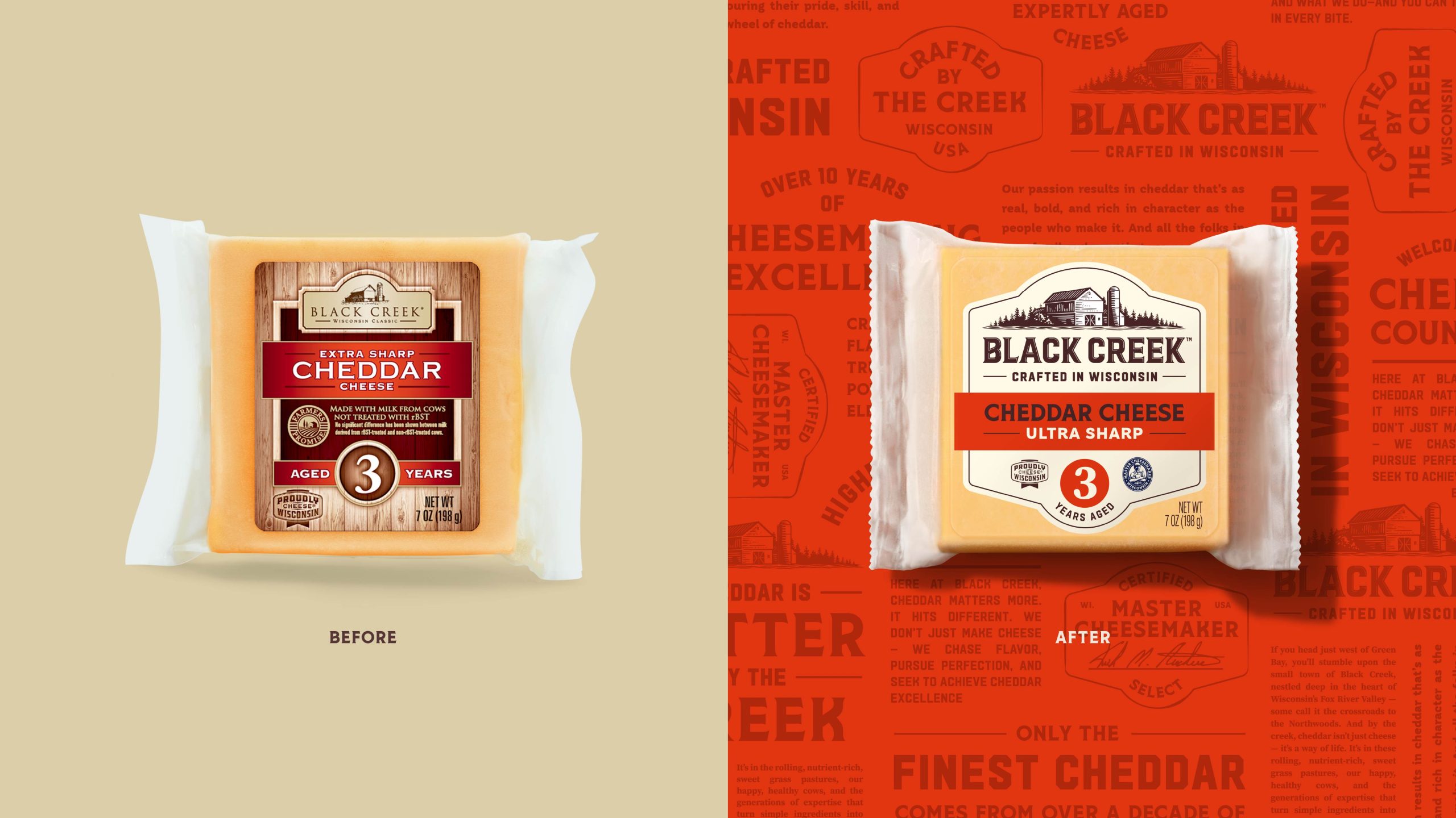
Black Creek’s refresh leans into the American roadside tradition with big, confident letterforms, a barn illustration, and a layout that feels like it could have been pulled from vintage feed-store signage.
Chase Design tightened up the system with a refreshed silhouette, punchier color blocking, and typography that stacks more legibly. Compared to the category’s usual cliched rustic tropes, this new identity feels more like a regional craft brand with a modern edge.
Get unlimited access to latest industry news, 27,000+ articles and case studies.
Have an account? Sign in


