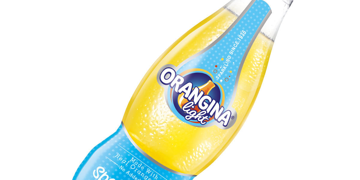
Flare and care — these are the two things that BrandMe had to keep in mind when designing Organgina’s new look. Kendra Johnson, Design Director of the company, elaborates: “Flare to be true to the brand’s vibrant and magnetic personality and care because we were dealing with a global institution.”
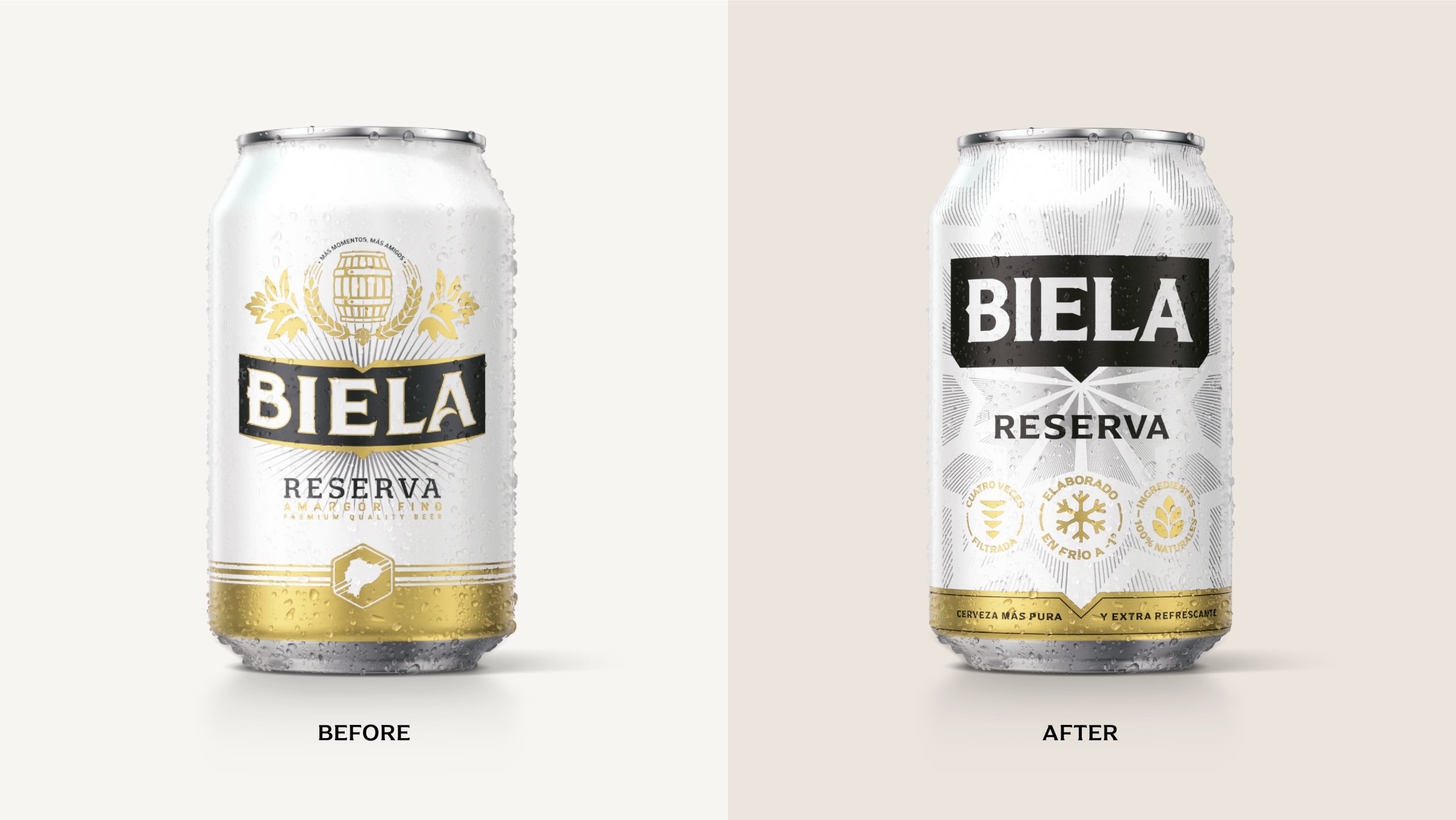
It is certainly a challenge to revamp a brand with such a history and current presence. While trying to potentially open up to a wider audience, businesses also don’t want to lose loyal customers with a completely unrecognizable or unrelatable redesign. BrandMe’s design for Orangina includes similar elements to its previous look while also appearing new and fresh, ready to appeal to an even bigger crowd.
“BrandMe’s new graphic design brings to life Orangina’s new brand essence. The new-look communicates Orangina’s premium and vibrant personality, targeting Open Socials: 22+ years who are actively seeking out small pleasures to make every day feel a little different. Critically, the brand also leverages the iconic bulby-shaped bottle and unmistakable taste of Orangina with its sparkle and real orange pulp, which has been recognisably Orangina since 1936.”