Beer enthusiast or not, there’s no denying that the signature craft beer line for Avtorska Serija looks like refined extravagance. The line was launched under the Persha Pryvatna Brovarnya (PPB) brand, and Milk Branding wanted to have it look cohesive among the brand umbrella but also distinguish the brews from its mother brand. At its core, the beer has “more pronounced saturated tastes brewed for indulgence,” and the goal was to convey this in a memorable way.
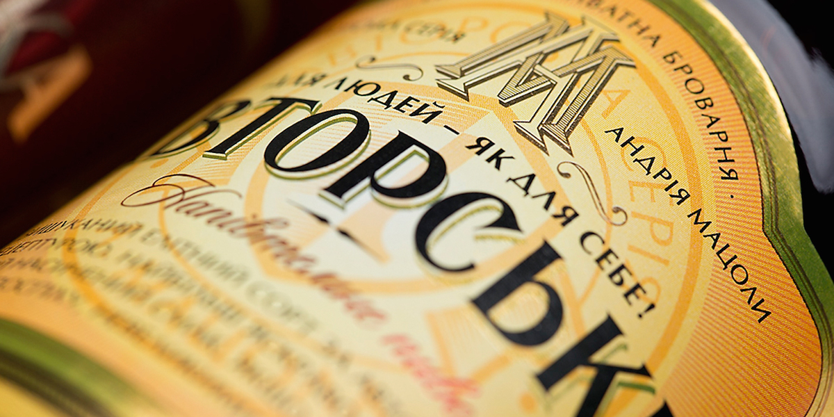
“The idea was to design a label and bottle shape consistent in spirit to the flagship look but interpreted in more premium connoisseur hues: Persha Pryvatna Brovarnya’s logo plays a visible part in introducing the new beers but is relocated to the bottle collar; instead a massive series logo is created – comprised of Andrij Matsola’s (PPB’s signature spokesperson, brewer and owner) monogram.”
The hearty brews feature brown and gold hues, just like the beer inside each amber bottle. Its labels offer plenty of information about the drinks, but the title of each stands out in a large, serif font.


