THIS IS IT! DIELINE Awards 2026 Late Entry Deadline Ends Feb 28
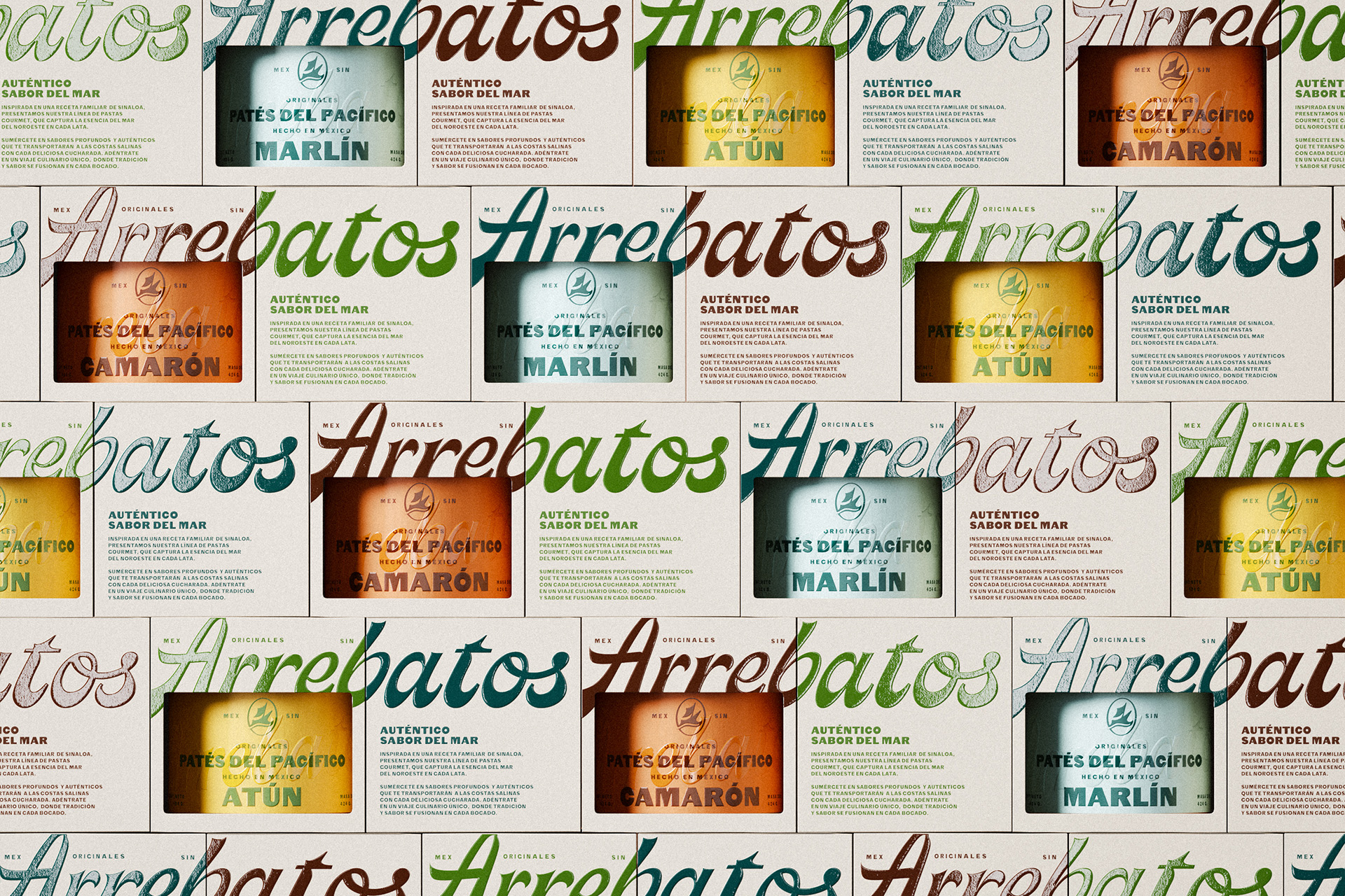
The redesign of Arrebatos by FAENA Studio swaps traditional seafood packaging tropes for something bold and expressive. The oversized cursive logo stretches across the label, while earthy tones and sea-toned blues play with contrast.
The jars get a hand-wrapped wax top, hinting at an artisanal touch. The old look was generic, but now, the packaging feels like a specialty item, something you’d find at a high-end market. The die-cut window on the box gives a peek at the paté jar, reinforcing the idea of quality while making the packaging feel dynamic and layered.
Get unlimited access to latest industry news, 27,000+ articles and case studies.
Have an account? Sign in


1 response to “Arrebatos Reinforces the Idea of Artisanal Quality”
This is a really beautiful use of color and embossing on the packaging that feel premium yet playful! I don’t like canned fish but would buy just for the jars.