Amfora Arc’s General Philosophy For Life Reflected Through Its Packaging
By
Published
Filed under
By
Published
Filed under
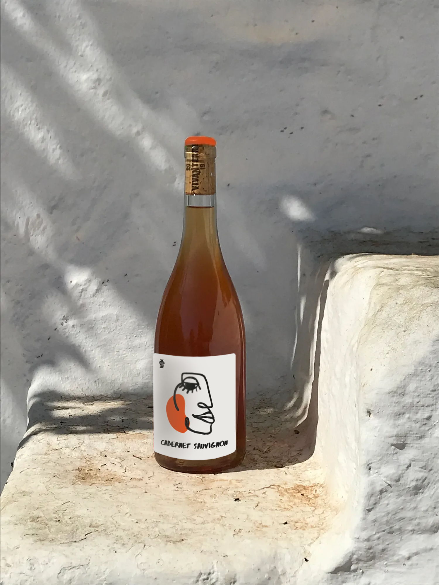
Annagrafika’s packaging design for Amfora Arc winery mirrors the ethos of natural winemaking and its deep connection with local producers. The white label with its generous use of white space exudes a sense of purity and simplicity. The hand-drawn line face on the label adds a touch of artisanal charm, enhancing the overall handcrafted aesthetic of the packaging. These illustrations not only evoke a warm and approachable feeling but also convey the winery’s down-to-earth sentiment, making Amfora Arc wines not just a beverage but a reflection of a genuine philosophy of life.
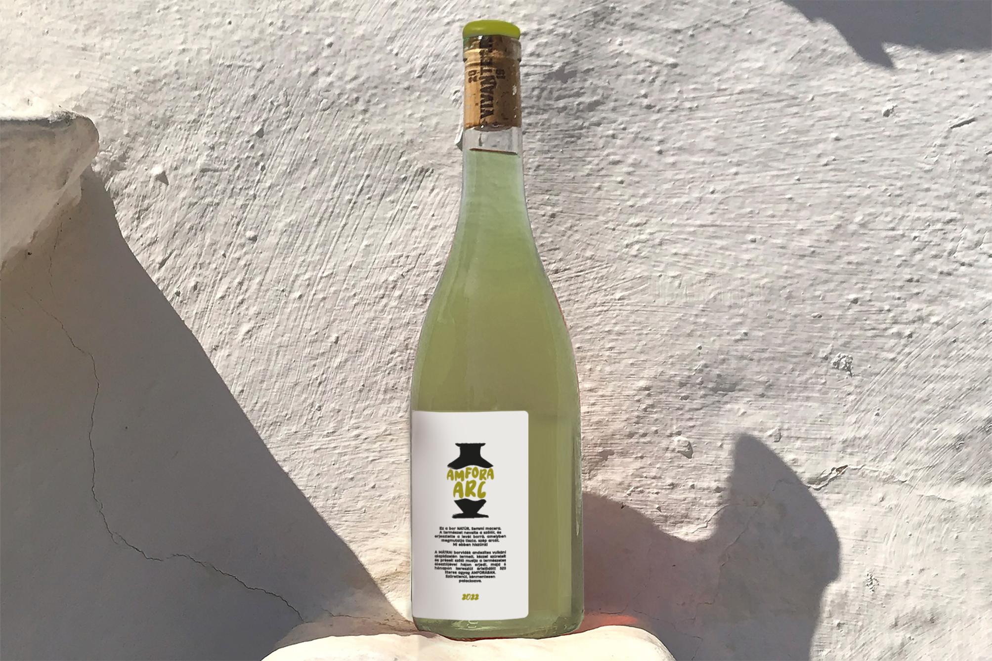
Amfora Arc is made by a family who decided to make wines that convey a philosophy of life: natural winemaking, small scale, manual production, fair relation with the local producers in amphora. My label design reflects their simplicity. There’s a simple hand drawn line face in their label.
Get unlimited access to latest industry news, 27,000+ articles and case studies.
Have an account? Sign in