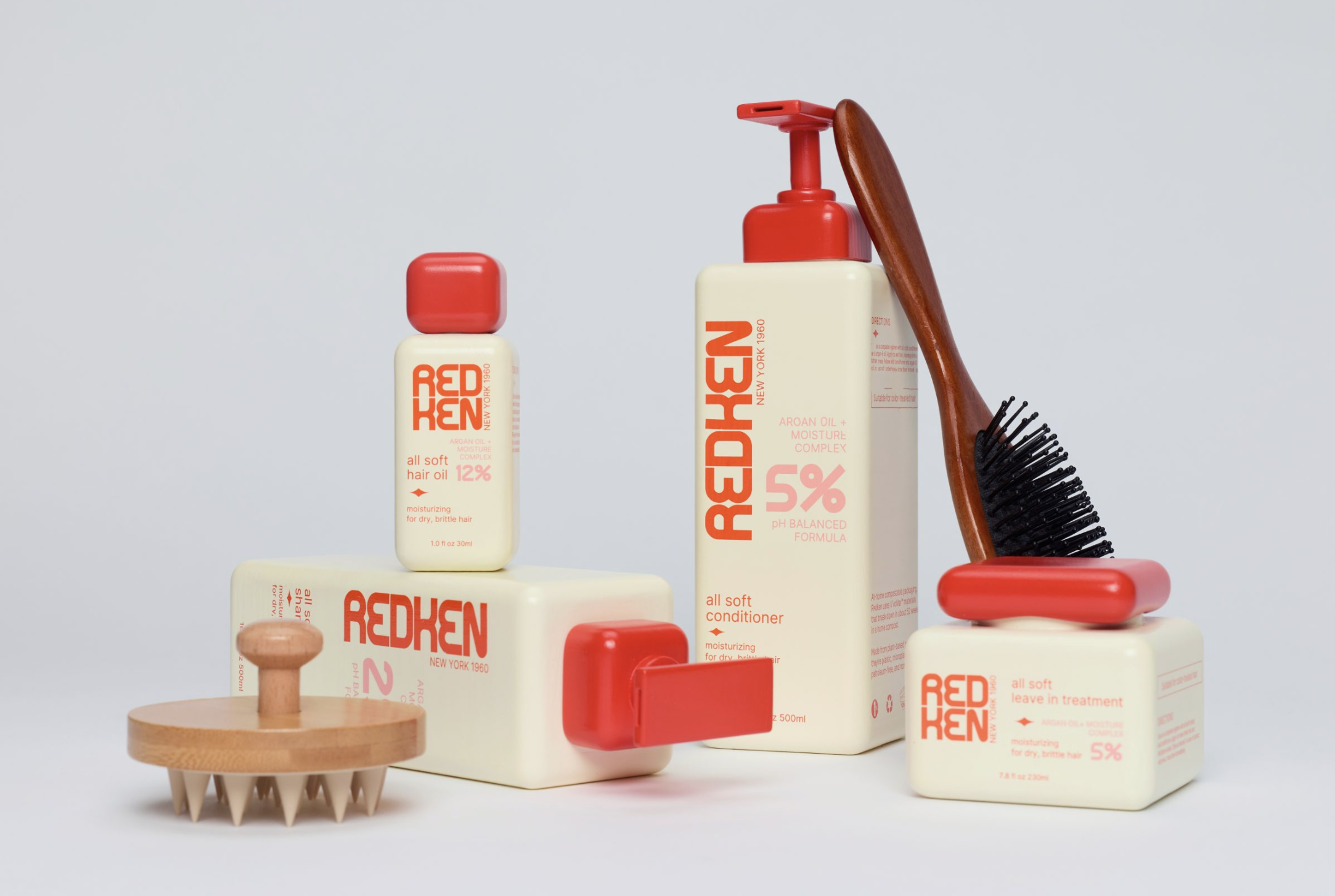
This Redken concept pushes straight into New York fashion territory, with a more editorial mindset.
Dahyun Kang draws on the brand’s scientific history and vintage laboratory packaging, translating those references into squared bottles, oversized percentages,, and product information that reads almost like a formula label. Meanwhile, the reshaped Redken wordmark gives the system a distinctly graphic personality. Instead of the flowing forms and polished salon cues common in haircare, this concept makes science look more trustworthy while also balancing approachability.