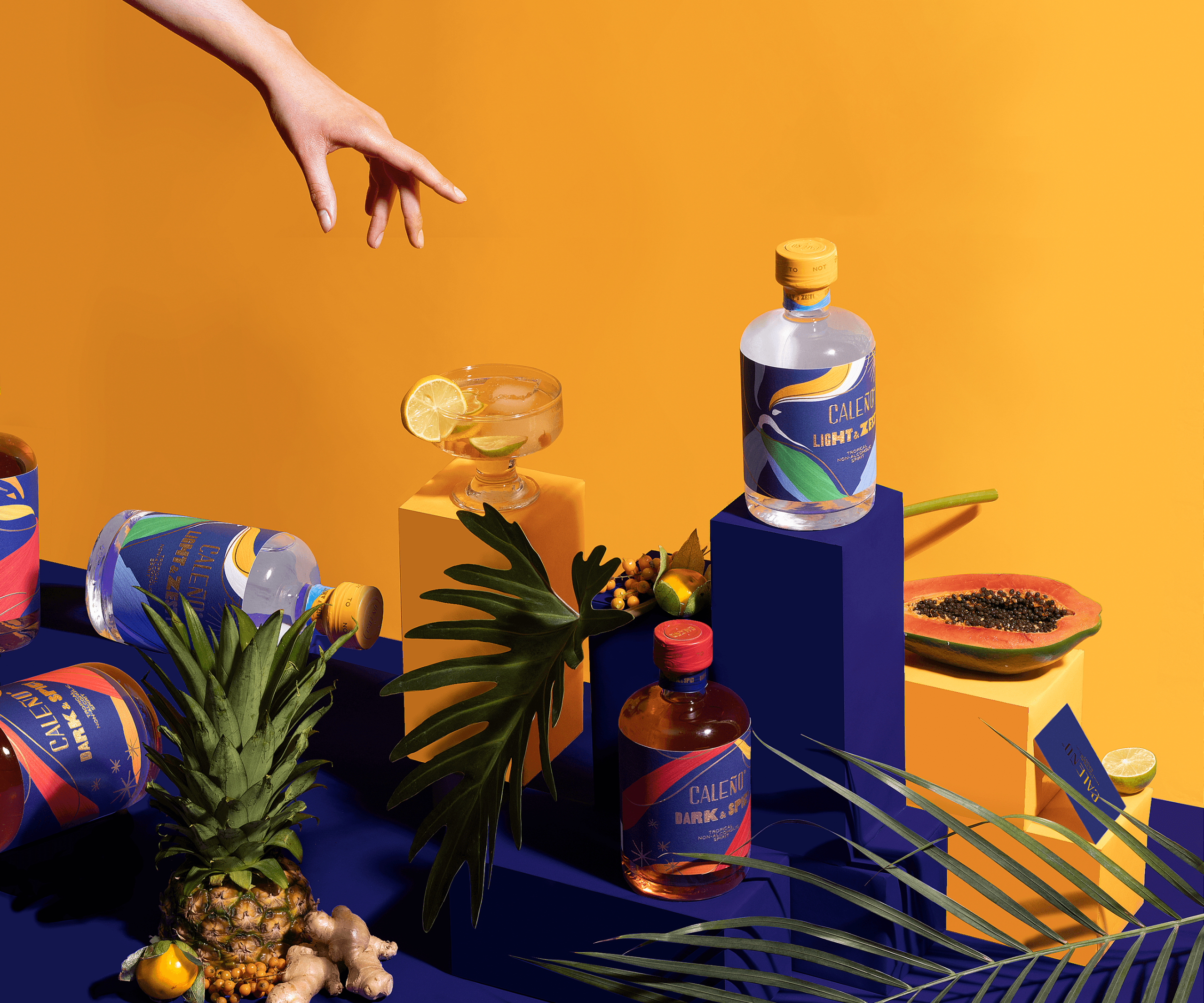
Most bottles just sit on the shelf, but this one is dancing. For Caleño, Toro Pinto builds on the brand’s signature blue by using a brushstroke-driven visual system that’s all about rhythm. Sweeping strokes of red, gold, green, and sky blue go across the label to form an abstract dancer in motion, a nod to Latin energy and celebration.
With Caleño set in elegant gold lettering that adds warmth and contrast against the deep blue backdrop. The gold foil details catch the light, and it’s a smart way to keep the SKUs consistent while keeping both their own.
What makes this packaging stand out in the non-alcoholic spirits space is its refusal to look overly minimal. Caleño embraces joy, movement, and cultural vibrancy, which aligns with the current rise of alcohol-free brands that celebrate occasions rather than a sense of sacrifice.