Highlands Coffee Brews Up a Bold Wordmark and Ascendant Peaks
By
Published
Filed under
By
Published
Filed under
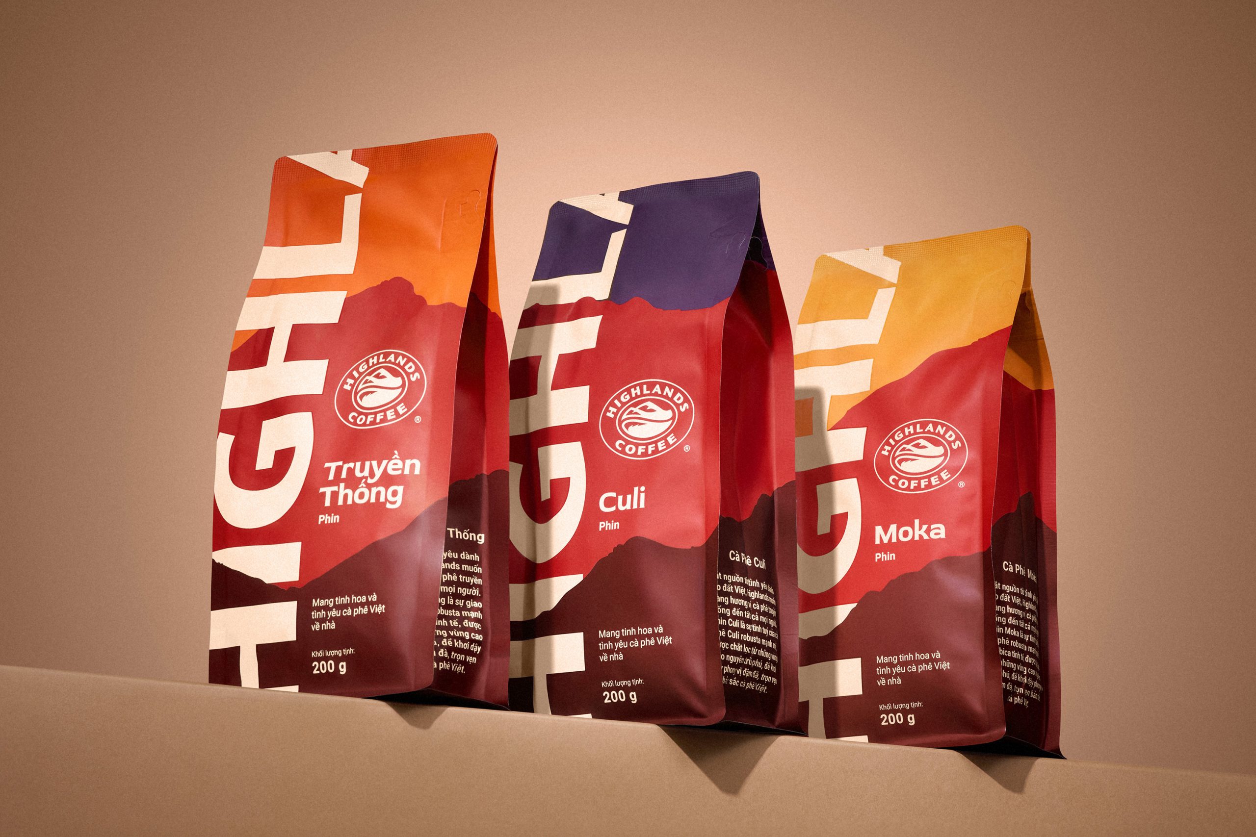
When it comes to packaging design, sometimes playing around with scale is exactly what you need to make a design pop. Highlands Coffee’s packaging by Base Design does just that for the Vietnamese coffee.
Typography slices across the bag, turning the brand name into a structural element rather than a label. Layered color fields in rust red, ochre, and deep plum highlight roasting depth, while subtle mountain silhouettes ground the design. Compared to ornate specialty bags, this design favors confidence.
Get unlimited access to latest industry news, 27,000+ articles and case studies.
Have an account? Sign in


