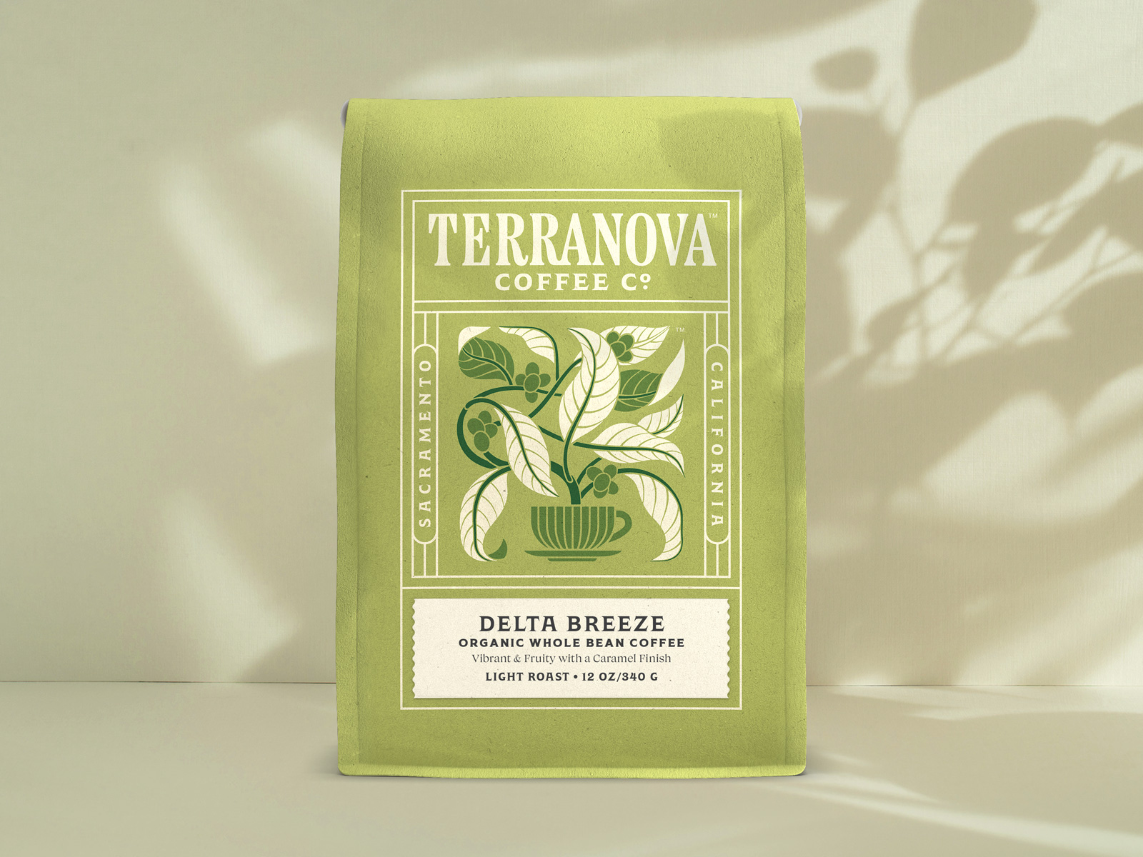
Terranova Coffee’s packaging by Pavement Design leans into an organic, structured aesthetic. The soft green tones echo the natural origins of the beans, while the intricate illustration merges coffee leaves and a steaming cup into a single fluid design.
The typography feels strong yet refined, framed in a structured layout that gives the packaging a timeless feel. The balanced symmetry of the label, paired with delicate linework, makes the packaging feel fresh while still rooted in tradition.
Michael Hester, Principal & Creative Director of Pavement Design, gives us a glimpse into the design process below.














1 response to “Terranova Coffee’s Artfully Grounded Packaging”
Thanks for the feature!