Derek&Eric’s Brand Identity For Lazy Tan Is Made In the Shade-Ready
By
Published
Filed under
By
Published
Filed under
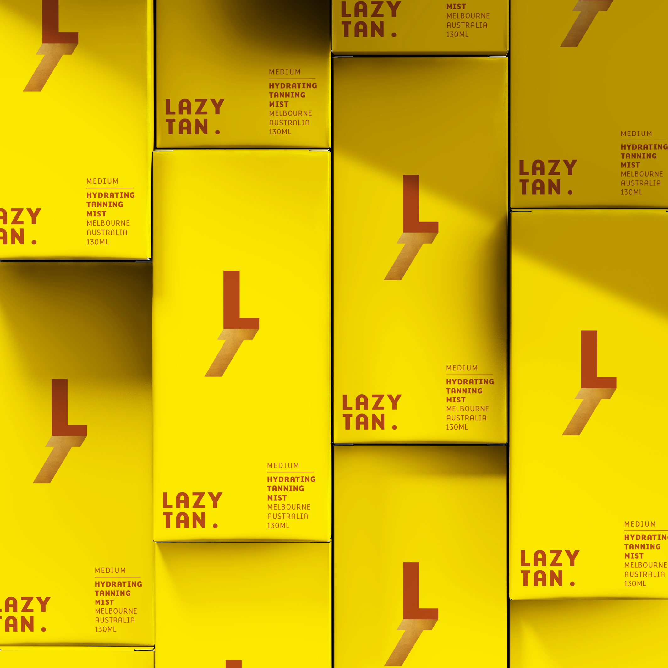
Designed by Derek&Eric, Lazy Tan’s packaging system features a bold yellow backdrop with terracotta accents. The shadow-inspired “L” icon is a clever nod to sun avoidance, giving the brand a strong, instantly recognizable identity.
Minimal typography guarantees legibility and reinforces the effortless sophistication of the product. The packaging balances energy with subtlety, reflecting the confidence of the tan it promises to deliver. Plus, the design feels more unisex than most brands in the tanning space.
Get unlimited access to latest industry news, 27,000+ articles and case studies.
Have an account? Sign in